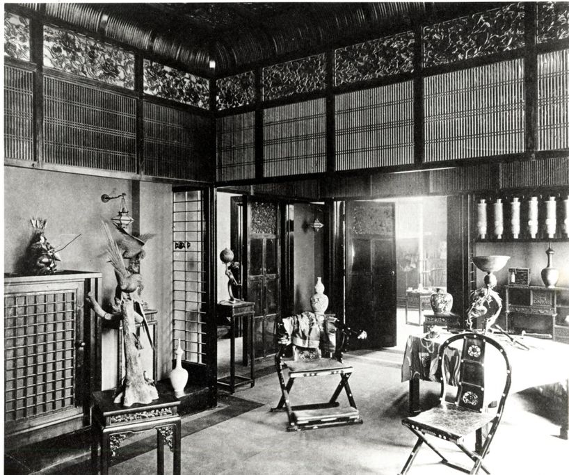
Architectural Japonisme, Part II
Early Architectural Japonisme in Europe, 1850's-1910's
________________________
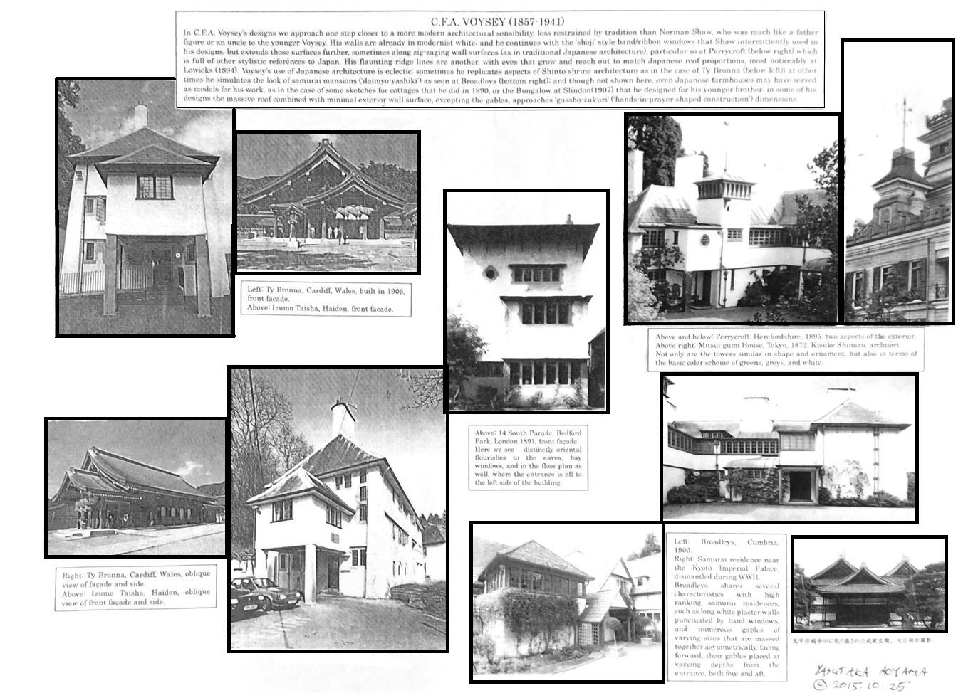
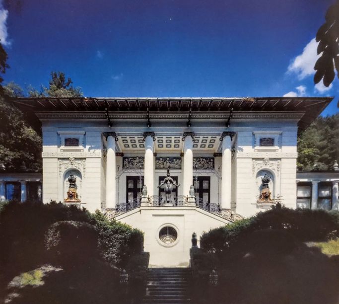
C. F. A. Voysey (1857-1941)
Part I: Exteriors
Perhaps Best Described as a 'Tibeto-Japanese' Melange
Architectural Juxtapositions, p. 22
Yasutaka Aoyama
Voysey's creative sources have not been sufficiently investigated. While his interiors can be evaluated within the context of the general trend of japonisme, his exteriors, while exhibiting elements of Japanese architecture, also exhibit commonalities with Tibetan, or more widely, Himalayan architectural forms, available, for instance, in the 1783 paintings of Bhutan dzongs by Samuel Davis.
The Tibeto-Bhutan parallels aside, circumstances and relationships of Voysey point to a link with Japanese art. For instance, Voysey, on the recommendation of his friend Arthur Heygate Mackmurdo (known for his involvement with Japanese interiors most notably that of the Mortimer Mempes House discussed later in this section), tried his hand at designing wallpaper, carpets, and textile designs, often using motifs which were very likely taken from katagami designs, an example of which is shown in Katagami Style (2012, supervised by Mabuchi Akiko, Director of the National Museum of Modern Art, Tokyo) of a poppy flower motif for a decorative fabric (c. 1894, exhibit #2033). The 1890's was a time when publications on Japanese design became readily available, and the astonishing diversity and dramatic visual impact of katagami attracted designers in all fields, including architects.
The following added 2024.9.14
Robert Schmutzler, a leading historian of Art Nouveau in the English-speaking world, in his classic Art Nouveau (1962,1977), after commenting on how Voysey was influenced by Arthur Heygate Mackmurdo, writes:
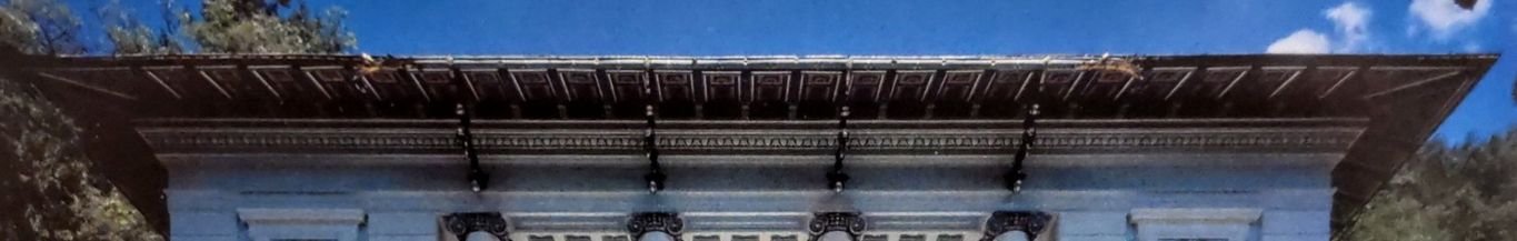
“However, for Voysey as an architect, Japanese influences were perhaps even more important, though they are scarcely recognizable as such in his work. One of his most interesting works, the tower-like house in Bedford Park [shown below, center] that he finished in 1891, is an exception. The light roof with its low gradient, the concave curved roofing of the oriels, the thin metal supports that seem to raise the roof over the body of the building, the unusually small windows, and the one stressed bull’s-eye window are not outright Japanese forms; but the graphic, abstractly ornamental, and asymmetrical character of the surfaces, the contrast in black and white between the apertures and the white-washed walls, not to mention the frieze-like disposition of various groups of windows under the thin horizontal ledges, all clearly reveal the relationship to Japanese architecture, easily recalling Japanese teahouses and small temples, as for example Voysey’s similar but lower and longer country houses, which are a particular national achievement of English art.” ---Schmutzler, Art Nouveau, 1977 abridged edition, pp. 128-9.
Yet we should add that those elements which Schmutzler categorizes as not obviously Japanese forms, as a low gradient roof, concave curved roofing, thin supports that raise the roof over the body of the building; or the bull’s-eye window---are in fact common features of traditional Japanese architecture, though not necessarily found together in one building. Even the small windows could be considered so, if we think of Japanese castle architecture. Indeed, the whole structure resembles a Japanese castle in various respects, including the frieze-like disposition of various groups of windows under the horizontal ledges, the white washed walls and their thick appearing aspect, and the contrast of black and white, though this is shared with Tibetan and Bhutanese architecture as well.
As to which inspired Voysey, Japan or Tibet/Bhutan in this case, either or both are possible; but as so much of his other architectural work reflects Japanese elements, both in his exteriors and interiors, as well as in his other designs, with hints such as “Tokyo” (wallpaper, 1893), the former seems more likely. Furthermore, models of Japanese castles were exhibited in Britain and on the Continent in world expositions and privately collected, and paintings and prints of castles abounded in England by the time of Voysey’s designing the Bedford Park house. On the other hand, Tibetan/Bhutanese models were scarcer though existing in sketches and paintings by a few, but we would not like to close the door on the possibility. It is an intriguing parallel, and at the very least it deserves mention as enriching our global perspective on modern architecture, even if there is no causative connection.
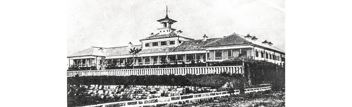
Below: An example of early Meiji era architecture, the Tsukiji Hotel, Tokyo, 1868. This was a hotel built for Western visitors. There are aspects of its design reminiscent of Voysey. Novel architectural forms were being produced in abundance in Japan from the late 1860's onward to the early 20th century, that precede the appearance of similar forms in the West. It might be said that much of the reputation for originality of certain architects in Europe or America in those days depends on an ignorance of the building activity going on in Japan at the time.
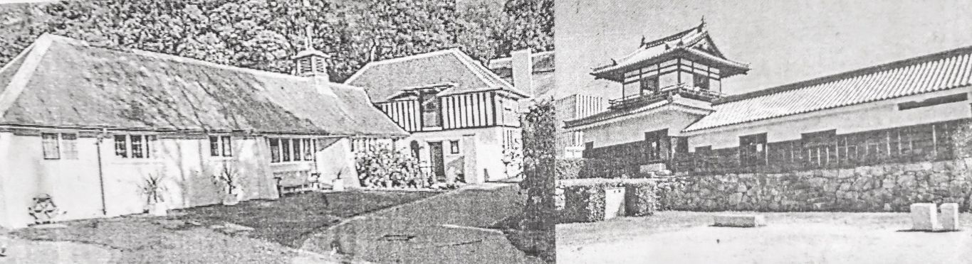
Below: Photos pasted side by side from the author's scrapbook, on the left is a Voysey designed house, on the right a Japanese castle 'yagura' (a corner tower and storehouse/sentinel quarters combination). Despite obvious differences, there is an affinity of general conceptualizations between Japan's and Voyseys' architecture.
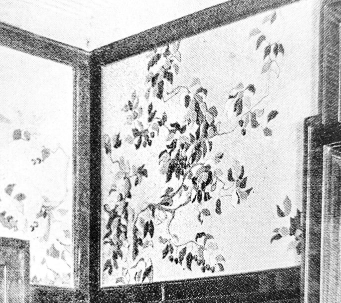
C. F. A. Voysey (1857-1941)
Part II: Interiors
Architectural Juxtapositions, p. 23
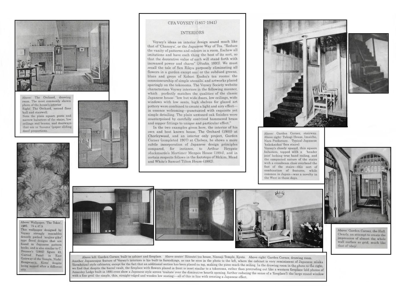
________________________
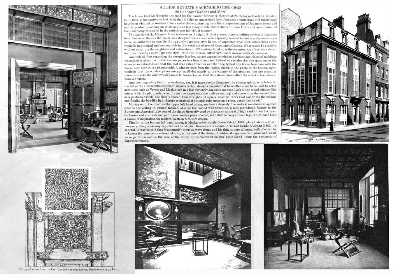
Arthur Heygate Mackmurdo (1851-1942)
Japonisme in a Pioneer of Art Nouveau
Architectural Juxtapositions, p. 29
Yasutaka Aoyama
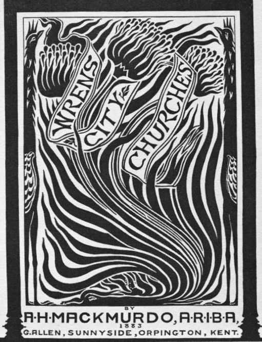
Arthur Mackmurdo's early designs such as his cover for Wren City Churches or Hobby Horse are considered precursors to the 'Art Nouveau' style. His characteristic thick wavy lines are of a type very much characteristic of ukiyo-e use of line found in woodblock prints. In Japan, from the earliest of times, reaching back to Jomon prehistory and carried on into the Edo period up to the 19th century, the bold and unpredictably curving line, whether representing water, fire, tree branch, wood grain or smoke has been a favorite theme for artists, cherished for its qualities of 'iki (stylish verve) and 'ikioi' (lively momentum).
Robert Schmutzler, one of the foremost historians of Art Nouveau, writes of the web of relationships that existed among artists involved with that movement, and the thread of Japanese design that was woven into it:
“Just as between Whistler and Rossetti, there also existed a relationship between Mackmurdo and Whistler and the Japanese style, and another one between Mackmurdo and Morris and the Pre-Raphaelites.” ---Schmutzler, Art Nouveau, 1977 abridged edition, p. 40.
.
Below left, a Japanesque folding screen by Mackmurdo, 1884, and right, another image of the Mackmurdo designed Mempes house. Scanned images by George P. Landow, at victorianweb.org and The Royal Borough of Kensington and Chelsea, at rbkclocalstudies.wordpress.com.
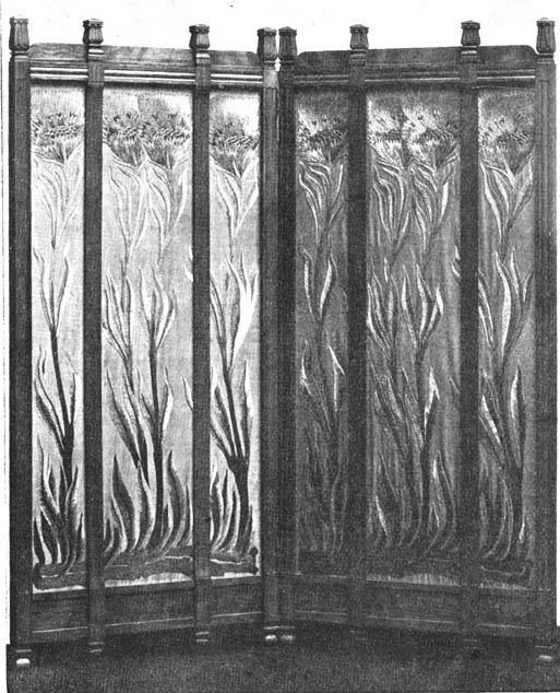
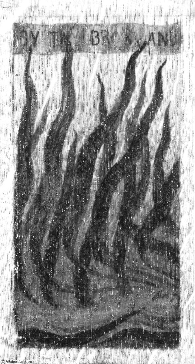
Below, 1st row: Mackmurdo's cover for the book Wrens City Churches with waving vegetation filling the picture from end to end (left), and a tryptych center panel of Mackmurdo's depicting wavy flames (right).
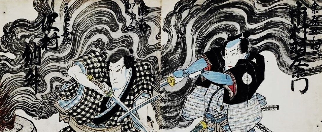
An Utagawa Kuniyoshi woodblock print of kabuki actors. The dynamic waves of billowing smoke are the real interest of the print, rather than the actors in front, which rise up and transform into Mackmurdo's wavy lines. This print is but one example of the Japanese genre depicting a variety of forceful waves and lively curves.
________________________
Hector Guimard (1867-1942)
Émile André (1871-1933)
Followed by brief comments on Henri Sauvage (1873- 1932),
Lucien Weissenberger (1860-1929), and Paul Charbonnier (1865-1953)
Art Noveau as Japonisme in Paris and Nancy
Lecture handout 2015, Architectural Juxtapositions, p. 31, comments added 2023 August
Yasutaka Aoyama
Hector Guimard is well-known for his Paris metro entrances, of which the Metropolitan Station, Porte Dauphine, built in 1900 (shown top right) and the Metropolitan Station Place de la Bastille, built in the same year (center top) are fine examples of his work showing clear indications of Japanese influence.
His use of case iron was masterful, and "...it was in this field that Guimard was to realise his most startling imaginative work---the natural world suggested fantastic forms of animals or human masks, akin to those of Japanese art, of a disquieting strangeness..." (Frank Russell, ed. Art Nouveau Architecture, 1979, p. 114).
And regarding one of Guimard’s celebrated architectural designs, the Castel Béranger, Robert Schmutzler, perhaps the foremost authority on Art Nouveau, writes that it was clearly Japanese art that was the driving force behind it:
“The most remarkable detail of the Castel Béranger consists in the surprisingly freely conceived asymmetrical ironwork of the main entrance, where Rococo blends with flamboyant Gothic. However, the decisive force, the stimulus that sets everything in motion, again springs from the flowing lines of the curves of Japanese woodcuts in particular and Japanese surface ornamentation in general. In the application of the characteristic features of these smooth and gliding lines, Guimard outshines even Horta, whose furniture basically appears knotted and cramped as if riveted together.” (Schmutzler, Art Nouveau, 1977 abridged edition, p. 100)
The Place de la Bastille station's 'karahafu' style shaped entrance, with its roof extending from a closely layered, multilevel roof, and the flat band of windows whose lines are integrated into the clearly demarcated rectangular sections of the wall, are reminiscent of Japanese temples (though the design seems to incorporate aspects of Nepalese religious architecture as well). Guimard was interested in a variety of Japanese art forms, which he transformed from paper or wood into metal and glass, thus incorporated them into his designs, as can be seen with the metal frame encasing a Japanese ukiyo-e print (top left), and the 'uchiwa' fan style roof, made of metal and glass jutting out over the Porte Dauphine station entrance (top right).
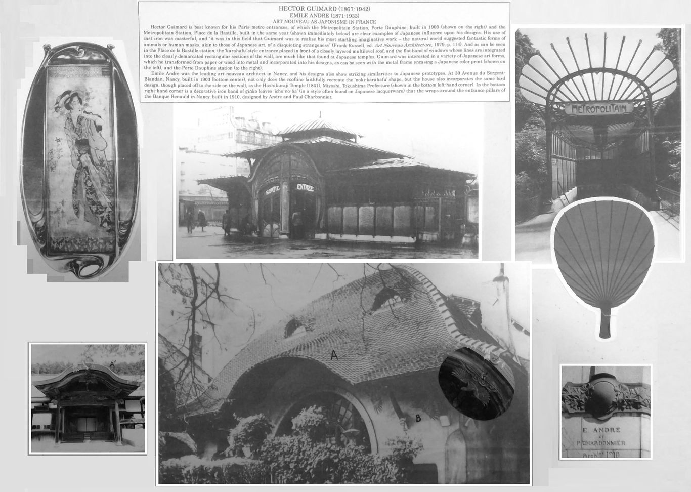
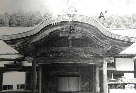
Below: Close up of Hashikuraji Temple in Tokushima prefecture with a typical carved bird with wide spread wings under a karahafu entrance (left) and the Emile Andre designed house in Nancy with an extremely similar painted bird under a karahafu style arched entrance roof (middle), with a close up of Andre's bird design with the Japanese example inset (right). Unfortunately, Andre's lovely japoniste bird design has disappeared--white washed--simply painted over. As in so many cases of famous works of architecture, traces of Japanese influence are eradicated by later generations, less cosmopolitan.
Nancy as a Center of Japonisme
(The following text and illustrations added August 2023)
It seems Nancy was a particularly active center of japonisme, especially among the architectural community there. The famous Henri Sauvage (1873-1932), also an architect at Nancy during this time, reveals an underlying Eastern inspiration in various aspects of his design for Villa Majorelle (1902). His prominent and multiform gables, and the loggia on the west facade for instance, suggest Japanese influences that had already been at work in the Stick Style in America decades earlier (see the following section on the Stick Style).
Japanese forms can also be seen in Lucien Weissenberger (1860-1929), who collaborated with Sauvage on the Villa Majorelle, and designed a detached stone garden kiosk-like structure, which is topped with what distinctly looks like a Japanese-type parasol.
In the case of Paul Charbonnier, while his architectural designs show less prominent indications of Japanese influence, his other artwork, such as the poster below, is clearly in the japonisme style, following the example of Hokusai's famous print.
Paul Charbonnier's 'Salon des Cent, Exposition d'ensemble' (1895) Hokusai's 'Hodogaya on the Tokaido Road' (1832).


The following added 2024.9.15
That there was in Nancy a general and keen interest in Japanese art among those involved with design is suggested by the activity of those in other fields besides, but related to, architecture and interior design. As Robert Schmutzler writes:
“It was not in Paris but in Nancy that French Art Nouveau achieved its greatest independence, reaching the highest quality in the glassware of Emile Galle (1846-1904)). … In the South Kensington Museum [London], he was fascinated most of all by Japanese glassware displayed there after the World Exposition of 1862. Chinese and Japanese glassware, above all the coloring techniques used in and complicated method of production and inspired his artistic style. In Nancy (where he settled in 1874 and founded his own glassworks) Gallé later became acquainted with a Japanese student, who had come there in 1885 to study botany. …
... It is difficult to establish a chronology of the productions of his own workshop, so that we cannot distinguish with any certainty when his Art Nouveau period started and when he actually arrived at High Art Nouveau. But a Far Eastern touch can always more or less be felt and must certainly have already been noticeable in the works he sent in 1889 to the World Exposition in Paris. E. de Vogue writes about Gallé in his Remarques sur l’Exposition de 1889, 'Let us praise the whims of fate for having allowed a Japanese to be born in Nancy.' " (Art Nouveau, 1977 abridged edition, p. 97)
---Reflecting, by the way, not only the strong influence of Japan upon Gallé, but also just how much good design was associated with Japan by the aesthetically inclined readership in France at the time.
Unfortunately, as in many such cases, we are not given the name of the Japanese student who seems to have been instrumental in Gallé’s endeavors. Schmutzler writes also of Gallé‘s collaboration with Prouvé in Nancy, creating furniture pieces of elaborate marquetry; these too show aspects of Japanese marquetry and lacquerware design which Schmutzler seems unaware of, which he attributes solely to a Rococo resurgence. That aside, it seems clear that the example of Japan loomed large in the hearts of those at the forefront of design innovation in Nancy, in architecture, and the crafts which furnished it.
________________________
Philip Speakman Webb (1831-1915)
The Red House and the Arts and Crafts Movement in England
Lecture handout, 2015.3.17, revised 2015.10.12, Architectural Juxtapositions, p. 37, with added material, 2023
Yasutaka Aoyama
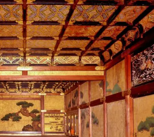
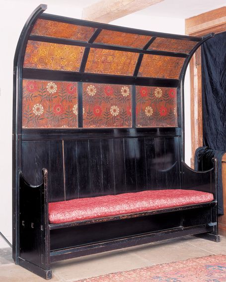
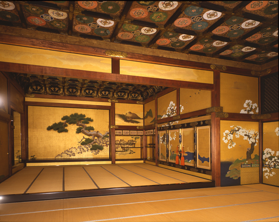
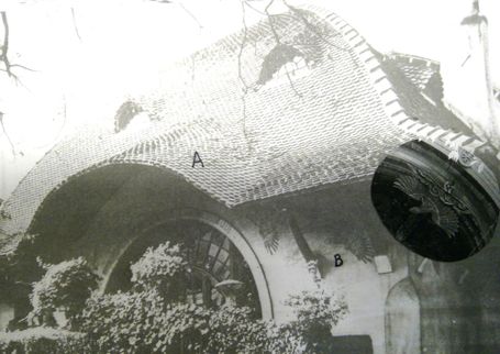
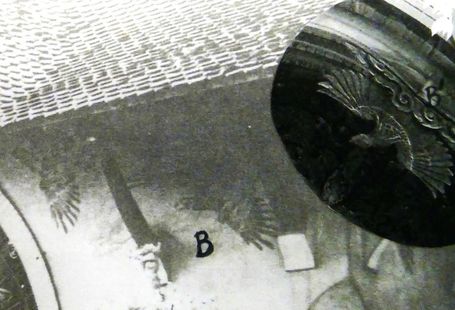
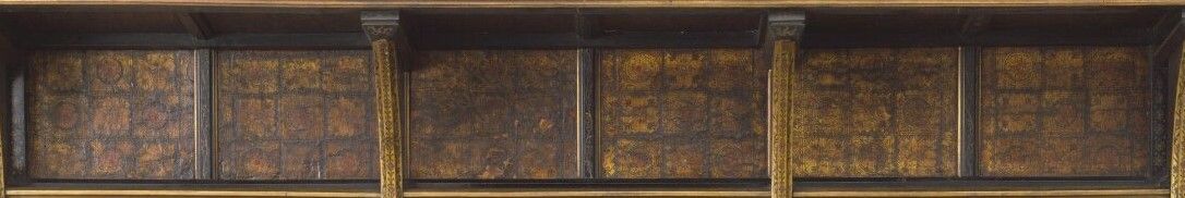
Above center is a settee designed by Philip Webb at Kelmscott Manor (but originally made for the Red House), that is remarkably similar in impression to the form and designs on 'gotenjo' (格天井) ceilings found in temples, shrines, palaces and castles in Japan, such as in Nijojo Castle, Kyoto, shown on both sides of Webb's settee.
The Arts and Crafts Movement is often discussed--strangely enough--in isolation from other contemporary artistic movements, such as the Aesthetic Movement at the time, and certainly not in relation to japonisme. Perhaps because William Morris (1834 – 96), its leading spokesman, never admitted to any Japanese influence. Yet in so many respects, the Arts and Crafts Movement--from the espousal of a general raising of the level of artistry in British craftsmanship, down to the specific textile designs Morris himself produced, show a strong affinity to the ideas and designs of Japan. A variety of Japanese artwork, artifacts, depictions, and accounts had been trickling into Britain particularly after Commodore Perry's expedition to Japan in 1853 and the Anglo-Japanese Treaty of Amity and Commerce in 1858. Such plausible influences however, are often met with disbelief, due in part to modern surveys of western civilization and art history which tend to minimize certain trends--even if they were once an incontrovertible part of everyday life. This holds especially true in the case of Japanese influence. As Elizabeth Aslin in The Aesthetic Movement: Prelude to Art Nouveau (1969, p. 79) writes:
"The impact of Japan on the decorative arts in England in the second half of the nineteenth century has never been fully explained though the influence itself passed through three clear phases each of which conveniently falls into a decade. In the eighteen-sixties it was a matter for individual collectors and enthusiasts, both in England and in France, and in that period Whistler produced his earliest Japanese-inspired paintings, Rossetti designed a Japanese bookbinding and a few amateurs began to collect lacquer, porcelain, glass and prints. In the 'seventies, the fashion was in full swing amongst informed people and Japanism and the Aesthetic Movement were virtually synonymous, while the Philistines scoffed. Interior decoration and furniture design were based on what were believed to be Japanese principles, rather than on the superficial forms and ornament which were the hallmark of the 'eighties when what had been a movement became a mania. Every mantelpiece in very enlightened household bore at least one Japanese fan, parasols were used a summer firescreens, popular magazines and ball programmes were printed in asymmetrical semi-Japanese style and asymmetry of form and ornament spread to pottery, porcelain, silver and furniture."
The Japanese artistic influence upon those associated with Morris or his wider circle, such as Edward Burne-Jones, Ford Madox Brown, Dante Gabriel Rossetti, and William Burges has been repeatedly documented. If William Morris himself did not admit to a general Japanese influence, those intimately associated with him did. Even Warrington Taylor, Morris’ business manager, in a letter to the architect Edward Robert Robson (1835–1917) who associated with the Pre-Raphaelites, clearly recognized Japan as a major force in shaping English art, architecture, and crafts, writing in praise of Japanese styles: "Japanese spirit of early Worcester china is good" and the "painted cabinets in Japanese style of Queen Anne time are good" and he considered English Gothic as being "Japanese" in its small, picturesque, and homely nature. (Warrington Taylor to E. R. Robson, in Mark Girouard, Sweetness and Light: The “Queen Anne” Movement, 1860– 1900. Oxford: Clarendon, 1977, p. 15.) One only has to dig a little below the surface, and around Morris, to find Japan firmly intertwined in the roots of the Arts and Crafts Movement.
The Red House below designed by Webb is a solid example of the early phase of japonisme in Britain.
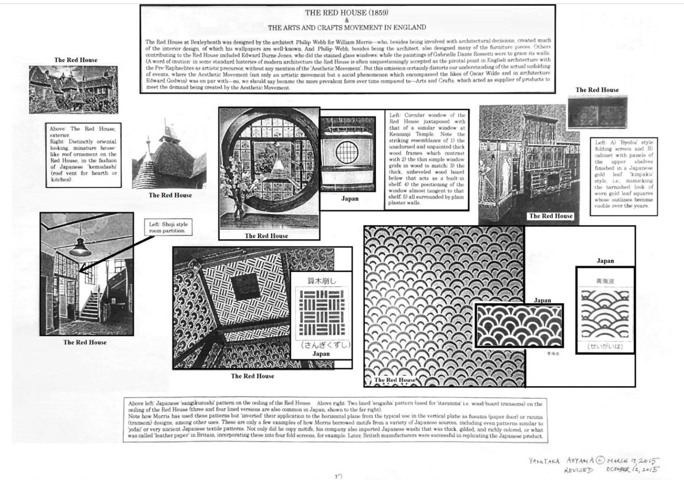
Below: Close-up of cabinet detail in the upper right hand corner of the lecture handout above. Note the squarish shaped indistinct pattern, very much like 'kinpaku' or gold leaf coverings pasted in similar squares, on Japanese walls/ceilings and byobu screens, whose divisions gradually become apparent and grow sullied over time. The main part of the cabinet, though not show here, is also very much in the style of Japanese box-like lacquer cabinets, adopted for Western style use, in vogue from the 17th century onward among elites in Holland and Germany.
Japonisme added color, verve, refinement, and diversity to English arts and crafts. Below, from left to right: Ford Madox Brown chooses to paint himself in front of a Japanese, or Japanesque screen (1877). Using Gothic motifs, William Burges has all but re-created the Nikko Shrine of the Tokugawa Shogun in his 'Summer Smoking Room' design for Cardiff Castle (1870). Recall that Burges, upon seeing the Japanese Court at the International Exhibition of 1862, declared "if the visitor wishes to the see the Middle Ages, he must visit the Japanese Court" (Ashmolean Museum, www.ashmolean.org/article/east-meets-west-in-the-victorian-colour-revolution). Walter Crane, well researched for his Japanese design proclivities, here creates a book binding (1901) that without the English words might easily be mistaken by anyone familiar with traditional Japanese patterns as being from that country. Edward Byrne-Jones, inspired by Japan to advance English aesthetics based on home grown sources, merges Japanese lacquer case and vegetal design into a discoidal object in 'Days of Creation--The Third Day' (1870-1876).
Though we will not delve deeply here, ceramic dishes by William de Morgan, while many are clearly influenced by Persian and Turkish ceramics, an equal number of other pieces are likely to have been influenced by Japanese Kutani ware, such as his blue, green and yellow colored plates with dragon or beast motifs (corresponding to 'ryu' and 'shishi' / 'komainu') or his all red on white ceramics reminiscent of red Kutani plates (some with fish motifs corresponding to swimming carp and jumping 'tai' sea breams), while his richly multicolored peacock plates (one shown below) may be considered part of the same stream coming from Japan that gave birth to Whistler's Japanesque peacock room. Besides being a common traditional motif in 'kacho-zu' (bird combined with flower designs), peacocks have been drawn and sculpted in painstaking detail for approximately a millenium as the vehicle of the Buddhist deity, 'Kujaku Myo-o'. Regarding furniture, Charles Robert Ashbee's designs at times shows similarities to those typical of Tohoku (northern) Japan, box-like with oversized drop-handle pulls against large back plates and elaborate escutcheons; while there are other pieces by him, more light and airy, that seem influenced by Edward Godwin's 'Anglo-Japanese' style or examples of thin, straight-legged laquered Japanese table and desks. And finally, some of William Morris's woodblocks at Kelmscott Manor for making prints on fabric, indicating the analogous nature of his approach to that of Japanese woodblock printmaking; and as in Japanese woodblock prints, it is said that sometimes a dozen or so blocks were used to complete one design.


________________________
Norman Richard Shaw (1831-1912)
A Confluence and Congruence of Japanese and English Taste
Furniture and Interiors
Lecture handout 2015.10.12, Architectural Juxtapositions, p. 39
Yasutaka Aoyama
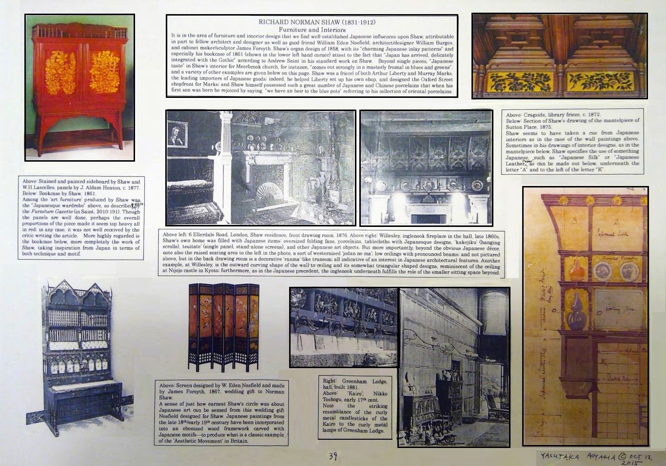
Regarding Cragside's interior design, Andrew Saint writes of the subtlety with which Shaw incorporates Japanese taste, before becoming obviously oriental looking in the years to come: "In the movable furniture weight and nimbleness respond to one another in fresh guise, llike the second subject in a symphony. Mass of table and density of carpet form a backdrop for a superb set of ebonized chairs made by Gillows, presumably from Shaw's own pencil though touched by the impact of the lighter early pieces made by the Morris firm. They stand for a moment of equilibrium in English furniture design, before the Japanese taste dissolves into the spindliness of aestheticism. Their neatly turned legs and cane seats are spiced up with discreetly exotic small back panels in gilt leather, parading pomegranates and picking up the tones of the frieze." (Richard Norman Shaw, revised edition, Yale Univ. Press, 2010, p. 84)
Regarding Shaw's designs for Meerbrook church in Staffordshire, Saint comments, after describing various decorative details and fittings of the chancel: "The Japanese taste, well subordinated in these fittings, comes out strongly in a masterly frontal in blues and greens, the first recorded piece to be worked by the ladies of the future Leek Embroidery Society." (2010, p. 303)
Richard Norman Shaw
A Confluence and Congruence of Japanese and English Taste
Architecture and Exteriors
Lecture handout 2015.10.12, Architectural Juxtapositions, p. 38
Yasutaka Aoyama
Text below added 2023.7.19
While the Japanese influence upon Shaw's interiors is straightforward, and of a decorative aspect, the influence of Japanese architecture upon his exteriors is likely to be met with greater skepticism. Yet the fact that the creators of the Queen Anne style, led by Norman Shaw and Edward Godwin, had a strong interest in Japanese art is undisputable, and and at times reveals itself in earlier proposals for houses, which are then modified to accustomed tastes (that might even be said of J.J. Stevenson, when one looks at his design for T.H. Green's house in Oxford, in its subtle asymmetric rendering of the exterior coloring).
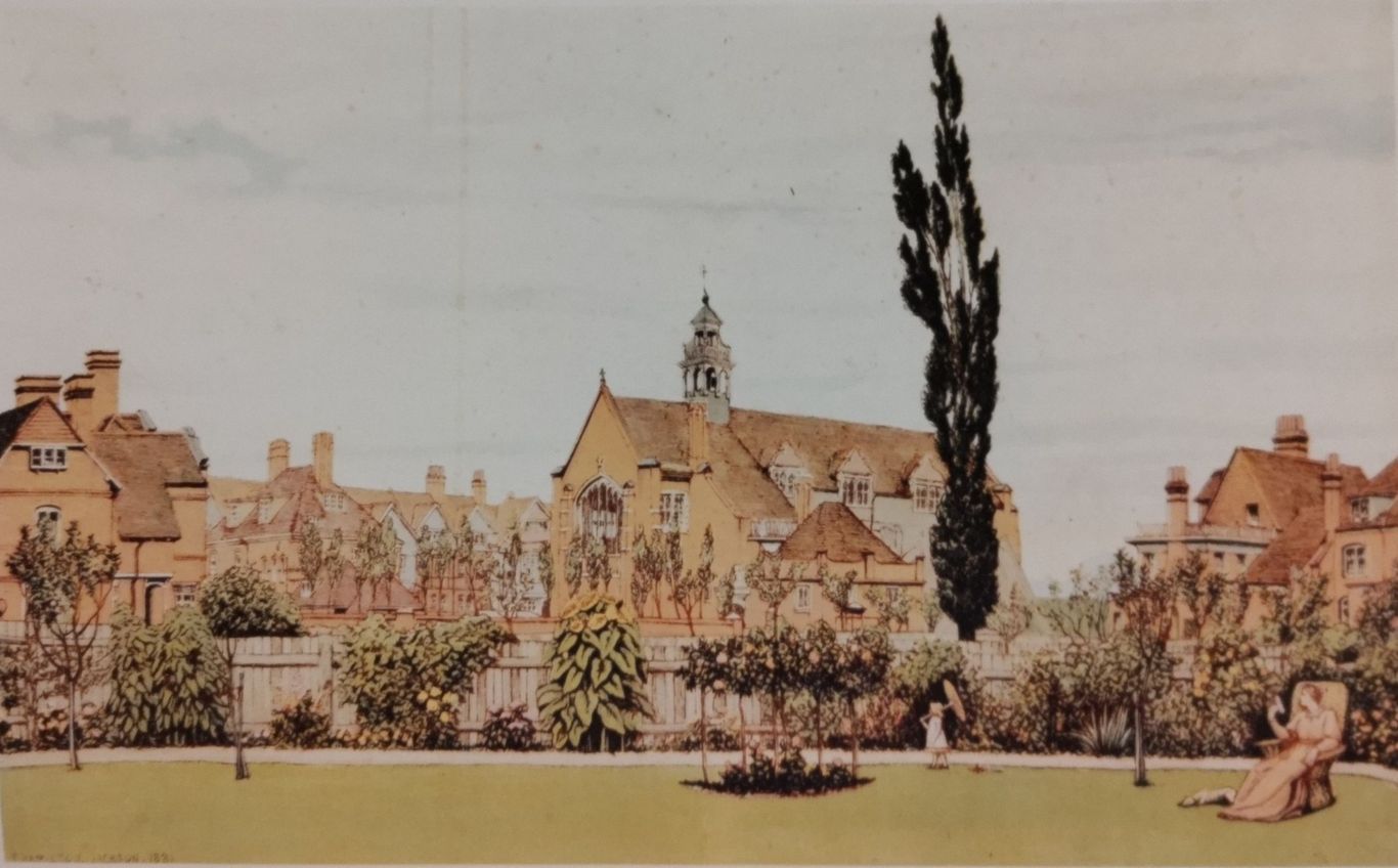
Consider the basic concept and imagery of Bedford Park, as visualized in Shaw's sketches of the place, such as his 'St. Michael and All Angels' (1879). It has an unmistakable ukiyo-e feel to it, for one who is familiar with Japanese prints. The single, slender, dominating tree, which extends to the top of the picture, is somewhat reminiscent of the compositional technique that impressionists and post-impressionists are known to have adopted from Japanese prints. Colored expansively in consistent tones of light green and orange, with touches of yellow and pale violet in clear outlines, with certain areas left unpainted, and with hardly any shadowing (as if high noon were a device to minimize shadowing), it calls to mind mid-18th century ukiyo-e prints such as those of Suzuki Harunobu, sharing the same quiet softness of his images, despite the obvious difference of setting. The small child holding a Japanese style parasol in Shaw's watercolor---has she been placed there almost as if a reminder---to evoke the imagery of a far away land transposed to comfortable England?
Much the same can be said of other better known images of Bedford Park, such as the cherry blossom or the very cherry blossom-like apple blossom filtered lithograph 'Bedford Park' (1882) by Manfred Trautschold.
There is no insistence that each and every correspondence below be considered one of cause and effect. Rather, they are pointed out to show a growing congruence of Shaw's designs with Japanese architectural forms in many respects, and not substantially in another direction. And that as a whole such a convergence, whether conscious or unconscious, makes sense given the exposure to images of Japan in published photos or pictures as those in the Illustrated London News (see Japan and the Illustrated London News: Complete record of Reported Events 1853 - 1899, publ. 2006); and in ukiyo-e prints, inevitably filled with architectural forms, which were also to be found on porcelains, lacquerware, fans and the like, the sort of things Shaw collected and enjoyed. In Harunobu's ukiyo-e, just to take one example of devices reminiscent of what Shaw would come to employ with frequency, large round windows near gridded shoji panels (light passing and thus like translucent windows) are a favorite backdrop.
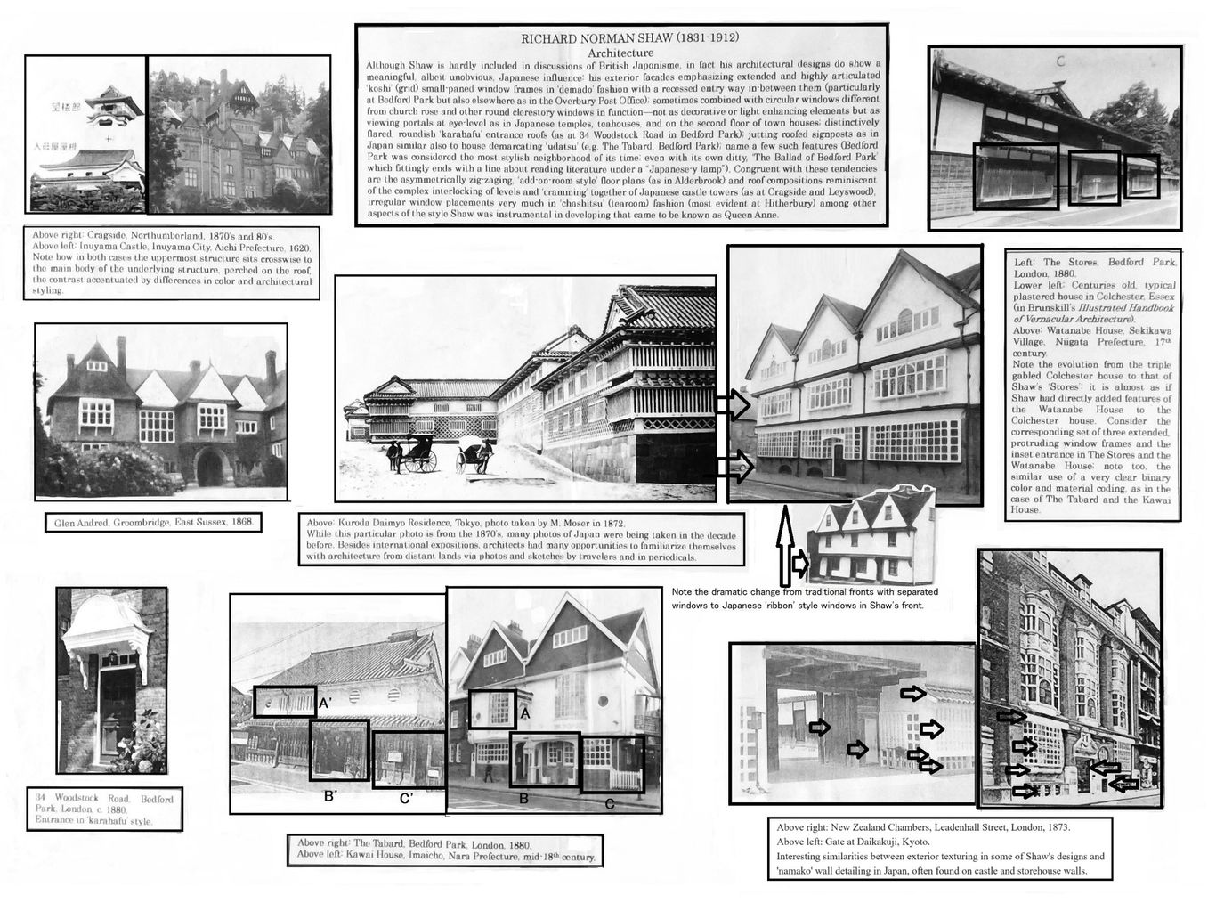
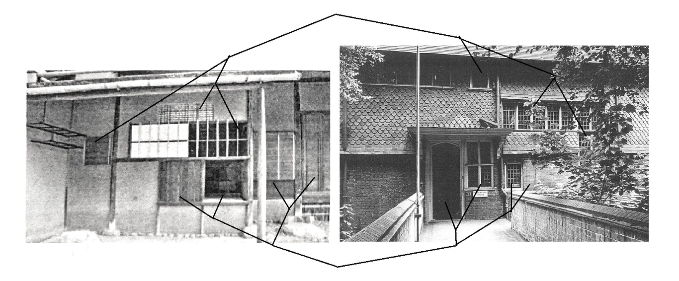
Below: From the author's scrapbook, the Shaw designed Hitherbury House (1882), Guildford, England on the right, next to an old Japanese teahouse 'chashitsu' on the left. Perhaps the most outstanding example of Shaw's incorporation of Japanese style architectural asymmetry, juxtaposition of elements of different scale, and textural variation for a facade.
For more on Shaw, see Architectural Japonisme II, 'William Eden Nesfield: An Unassuming Japonisme'.
________________________
Charles Rennie Mackintosh (1868-1928)
Part I: Functional Readaptations of Japanese Designs
(with Observations on an Interior by Sir William Reynolds-Stephens)
Lecture handout, scrapbook form 2015.6.30, Architectural Juxtapositions, p. 40, note on Reynolds-Stephens added 2024.9.17
Yasutaka Aoyama
"To those with eyes to see, however, and especially to Mackintosh, the Japanese house presented a new challenge. Could the delightful freedom and spaciousness of the open plan be translated into Western terms; could its remarkable flexibility and exciting aesthetic potentialities be exploited under the climatic conditions prevailing here? These questions Mackintosh attempted to answer in his own way by the use of openwork screens, balconies, and square post and lintel construction. The influence of Japan is evident throughout his work, especially in the Cranston Tea-Rooms, and in the library at the Glasgow School of Art--even the boldly cantilevered galleries of Queen's Cross Church have at least one counterpart in the Far East, the balcony of an old inn at Mishima, illustrated by Morse."
Thomas Howarth, Charles Rennie Mackintosh, p. 225.
Mackintosh's first major biographer, Thomas Howarth, pointed out early on in his 1952 award-winning book, Charles Rennie Mackintosh and the Modern Movement, the importance of Japan as an artistic influence on Mackintosh (see also Andrew MacMillan, 'Charles Rennie Mackintosh: A Mainstream Forerunner' Architectural Association Quarterly, vol. 12 no.3, 1980). There are many aspects of Mackintosh's Hill House, as well as his other creations such as the Willow Tea Rooms and his 78 Derngate house, that reveal an eclectic array of Japanese motifs. Those influences range from the kimono (e.g. his well-known 'kimono cabinet') and ikebana flower arrangement, to Buddhist temple design and ornament. Even his watercolor botanical sketches are reminiscent of sumi-ink painting, and are at times signed in a vertical, oriental fashion, with the words framed (boxed in) as in Japanese prints (e.g. his sketch 'Japonica'). That Mackintosh had an interest in Japanese art from his early days can be gleaned in a circa 1890 photo of Mackintosh's studio bedroom at Dennistoun, Glasgow, where an unidentified ukiyo-e print can be made out above the mantlepiece, though the Japanese lettering is indiscernible. Glasgow's relationship with Japan was closer than most might think in those years, thanks to the shipyards at the River Clyde where there was much contact with those related to shipbuilding, such as Japanese navy engineers.
Below are some examples of Mackintosh's 'functional re-adaptations' of Japanese, especially Buddhist, architecture and ornament. A temple for instance becomes a library or a shoji window the back rest of a chair, for instance.
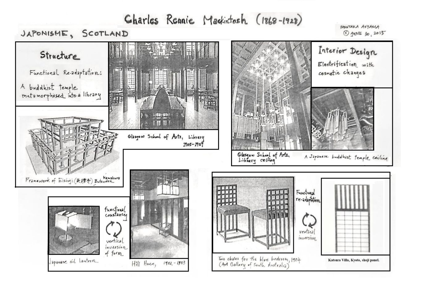
Below left: the Willow Tea Rooms, first two floors. Right: typical Japanese merchant house of the Edo period, with the 2nd floor walls in white with the quintessentially Japanese grilled window and first floor in dark wood, also with continuous windows with the lower half cut out towards the end.
Below: Comparisons of various aspects of Mackintosh's interiors and exterior decor to the left, vis-a-vis elements of Japanese Buddhist temples and other buddhist paraphernalia to the right. Note the prominent use of black lacquer furnishings and hanging golden ceiling ornaments, and white silk panels or white plaster walls, abstracted in Mackintosh's 78 Derngate, Northhampton house, but still recognizable. These are but a few examples; not shown for instance, is a comparison of the large metal, somewhat bean-shaped ornaments that hang from Jodoshinshu sect temples of which an almost exact duplicate existed in Mackintosh's Willow Tea Rooms.

")

")

")

9th century")


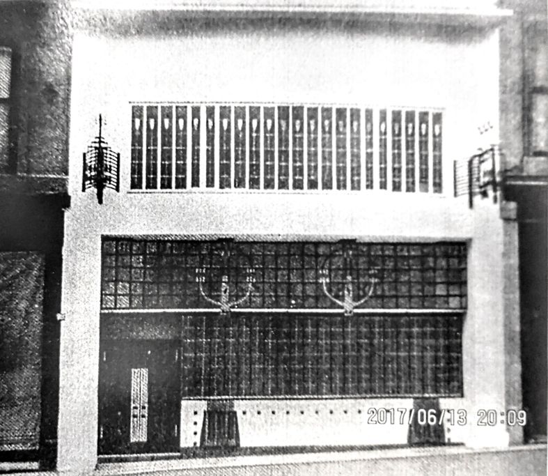
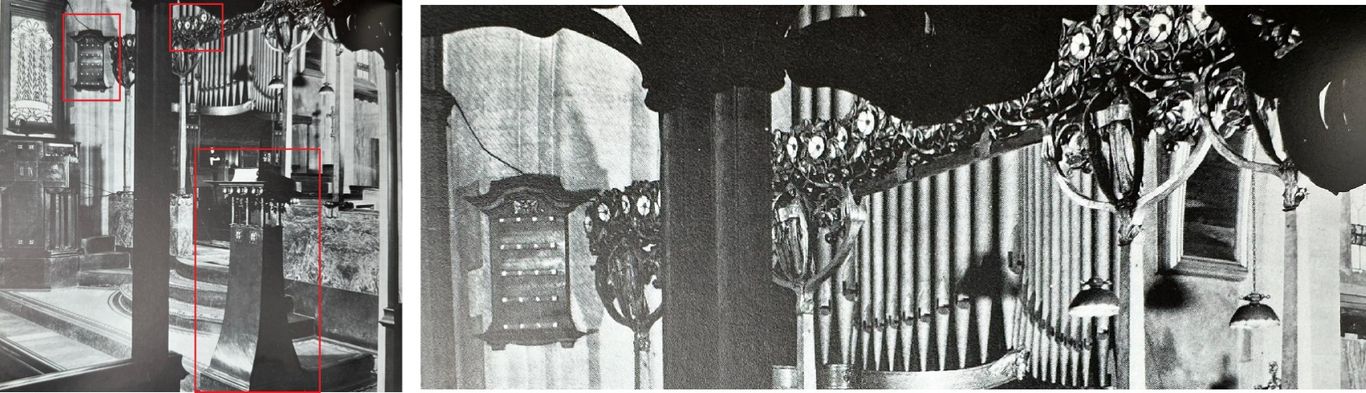
We might note as an aside that the interest in Japanese religious architecture was not limited to Mackintosh. Echoes of sacred Japanese architectural elements are found early on in the American Stick Style, discussed earlier, as well as elsewhere in Britain in Mackintosh's time. A good example is William Reynolds-Stephens' (1862-1942) design for the interior of St. Mary the Virgin, Great Warley, Essex (1904), shown below, which was completed just before the building of Mackintosh's Glasgow School of Arts Library (1905-1909). The elements blocked in red reflect various aspects of Buddhist temple or Shinto shrine structures and ornament.
In the foreground of the picture to the left is a minature tower-like structure, which looks as if made of metal, whose form is much like that of a temple or shrine 'toro' (stone or wood lantern). To the right is a close up of the upper part of the photograph (from R. Schmutzler, Art Nouveau, 1977). In it is a hanging, roofed, plaque-like object much like a 'zushi' (minature, portable reliquary) in form, and to the right of it running horizontally is a metal ornament with a floral design, reminiscent of temple or shrine eave decorations.
Charles Rennie Mackintosh & Margaret Macdonald Mackintosh
Part II: Transmutation, Intertwinement, and Overlay
Lecture handout, scapebook format, 2015.6.30, Architectural Juxtapositions, p. 41
Revisions, editing, and added commentary 2023.9.16 -28
It appears that the Mackintoshs took inspiration from a variety of Japanese art forms including ukiyo-e bijin-ga (pictures of beautiful women, often courtesans), sumi-e (charcoal painting) or suiboku-ga (landscape ink wash painting), and ikebana flower arrangement, especially its mixed use of flowers and edamono (tree branches) or tsuru (vines, e.g. fujizuru or kokuwazuru) in the traditional Japanese convoluted and whimsical manner. They may also have discovered the Japanese art of packet wrapping and decorative tying known as mizuhiki with its complex loops and long streaming threads. These sources were combined and 'transmuted' into art of different media, namely paintings and sculptures, their forms reflected in the strong and multitidinous lines found in their works, those lines often overlaid or fused with bijinga type figures.
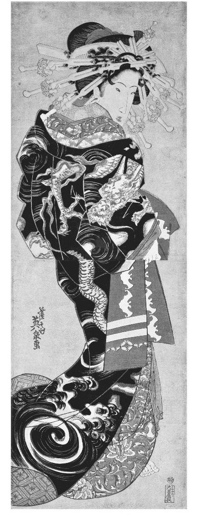
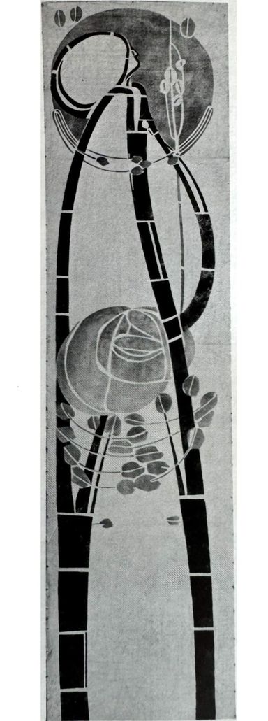
The following is an attempt to illustrate the idea, taking a decorative wall hanging (1902) by Charles Rennie Mackintosh as an example, on the right. On the left is the ukiyo-e print 'Unryu Uchikake no Oiran' by Keisai Eisen (1790-1848), the courtesan print that Van Gogh modeled his painting 'The Courtesan' upon. She is in a classic ukiyo-e pose, depicting a female figure in flowing robes with her hair bunched up in the back, poised in a way where she is somewhat sideways with her shoulder accented, jutting towards us, her face at an angle partially hidden.
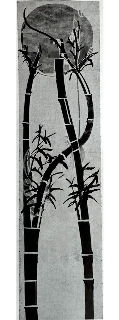
In the center, this author has taken the liberty of creating a quick, kakejiku (hanging scroll) type painting using Mackintosh's picture, making some modifications but relying very much on Mackintosh's original design. More bamboo twigs and leaves are needed, but enough is there to show how close Mackintosh's wall hanging is to sumi-e hanging scroll compositions, including aspects of detail (as the bamboo segmenting or leaves silhouetted by the moon). It seems highly probable that Mackintosh was inspired by sumi-e / suiboku-ga scroll imagery depicting bamboo in moonlight, a common motif in that type of painting. In Mackintosh's picture the bamboo trunks have become outlines of the woman's robe-like dress; a large rose or other flower-like shape sits where usually a mass of bamboo leaves would typically be painted; or otherwise where the bold, focal element of a kimono or uchikake (long overgarment) might be displayed in a bijinga---in Eisen's print it is the face of a dragon, but a large flower or other round shape would not be uncommon.
It is not difficult to see how Mackintosh's image is an amalgamation and entwining, or otherwise an overlaying of imagery, to create something new, which draws from the artistry and emotional content of those very disparate artworks.


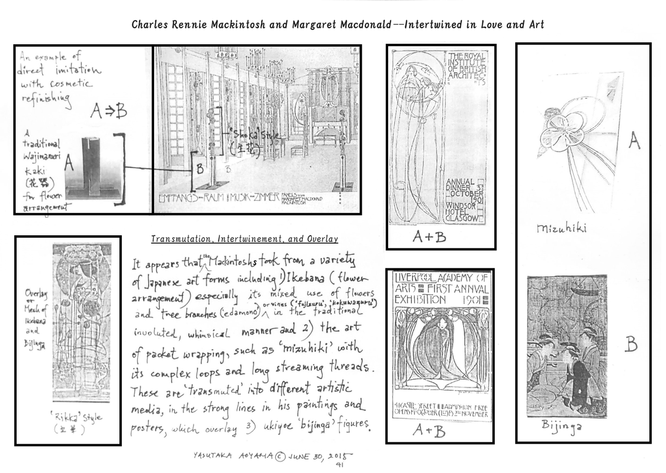
Though barely discernable in the bijinga image above (bottom right corner), in the background of the three women is a ikebana display of curving, interwined branches. In Japan flower arrangements have traditionally incorporated the branches, twigs, vines, and leafs of plants much more so than in the West (where flower arrangement until then was basically making a bouquets of flowers) and it was this more primal, vegetative aspect that must have caught the attention of the Mackintoshes, and the complex and convoluted formations that were actively pursued by ikebana artists.
Below: left--his watercolor 'Japonica'; center--a sketch signed a labeled horizontally in Japanese fashion; right--a juxtaposition of a Mackintosh sketch and a Japanese traditional sketch of lilies.


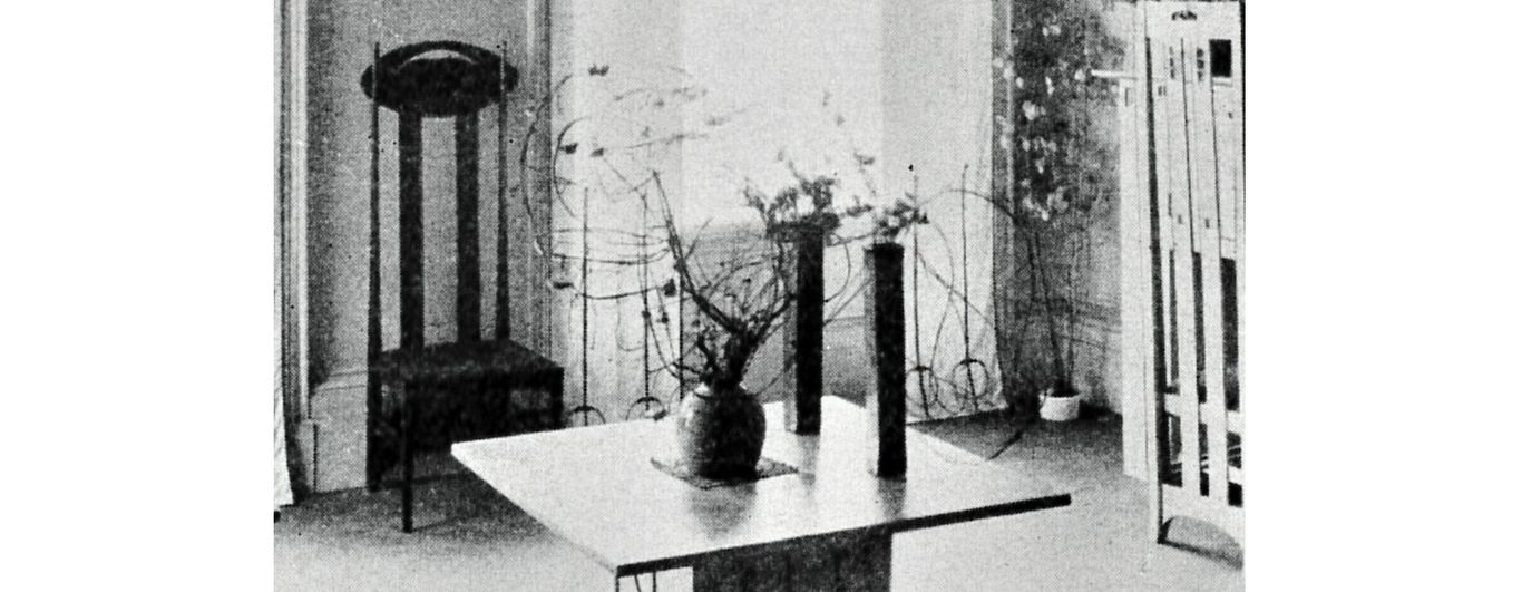
Living with ikebana
It seems ikebana was a heartfelt passion for the Mackintoshes, and not just a device for designs. The Mackintosh studio flat, 120 Mains Street, Glasgow (1900) was overflowing with multiple ikebana-type flower arrangements it seems, as captured in the photo below (from Howarth, 1952). Note the tall, rectangular 'kaki' (flower arrangement container) style vases, peculiar to ikebana in Japan. On the mantlepiece, not visible here, were ukiyo-e prints (See Erin McQuarrie, 'Ma, Mon, Tori-i: The Influence of Japanese art and design on Charles Rennie Mackintosh's masterwork, The Glasgow School of Art'. Glasgow School of Art dissertation.)
The influence of suiboku-ga, or Chinese style ink wash painting in Mackintosh
Below: 1) Sesshu, 'Winter Landscape',15th century (Univ. of Michigan); 2) Mackintosh, 'The Rocks', 1927 (in Howarth); 3) Mackintosh, 'Le Fort Maillert', 1927 (in Howarth); and 4) Ike no Taiga, 'Mountain Landscape and a Waterfall', between 1750-1776 (Univ. of Michigan).
Regard the striking similarities, particularly between the first two images. Sesshu (1420-1506), the most renown of Japan's suiboku artists (acclaimed as the greatest painter alive during his stay in China by his contemporary Chinese painters), was prominently featured in books on Japanese art by the early 20th century in Europe and America, thanks to men like Ernest Fenollosa.
The idea that 'rocks' were a worthy subject of painting on their own, that they might be allowed to fill a canvas with little else, and that they were objects of immeasurable aesthetic value, in fact of religious veneration, was of course new to Western painters, and must have been a significant aesthetic revelation. The techniques of painting rock formations was an ancient and well-developed technique in China, and carried on by Japan, whose artists leaned towards either extremely soft (e.g., Uragami Gyokudo and Hasegawa Tohaku) or more sharply formed outlines (e.g., the Kano school and Hokusai's painted landscapes) as found in Mackintosh. The numerous suiboku techniques of painting rock formations, each with a name, and the manner in which Mackintosh has attempted to assimilate them, requires a paper of its own and will not be delved into here in depth; suffice it to say that even to an untrained eye, various aspects of form, shadowing emphasis, over all composition and detail, and what one might call 'directionality' and 'presence', take from suiboku models.
Just to point out a few specific points of interest, observe in Mackintosh's 'The Rocks' how 1) the smaller foreground rocks on a flatter ground surface paralleling those Sesshu, and 2) the creation of open spaces toward which the rocks lean, 3) the various similarities in the grouping of rocks, and of course 4) the similar layering technique of the rock surfaces.
The second pair is a comparison of Mackintosh and Ike no Taiga (1723-76), one of the great 'bujin-ga' (literati painting) painters of the Edo period along with Yosa Buson. While Mackintosh's 'Le Fort Maillert' rock textures might resemble other suiboku works better, the fundamental compositional equivalence of squat, massive, squarish rocky formations, filling up much of the picture space, one taller with a waterfall between them, is worth noting. In Mackintosh's work, the waterfall has been transformed into a vein of the rock itself, but its fluvial origins can be discerned. The classic example of this type of squarish rock formation is Fan Kuan's (late 10th to early 11th century) iconic scroll painting 'Travelers among Mountains and Streams' (谿山行旅図) at the National Palace Museum in Taipei, and which is also characterized by broad, flat rock surfaces.
 Sesshu")
 Taiga")
 Mackintosh")
 Mackintosh")
Some further observations regarding Mackintosh's spouse, Margaret Macdonald


Mackintosh's wife Margaret also incorporated various Japanesque qualities into her art, as discussed earlier, and can also be seen in her painting 'The Opera of the Seas' (between 1903-15, whereabouts unverified) shown above. This may be fruitfully compared to the design of Edo period lacquer picnic boxes, such as the one at the Suntory Museum of Art (Tokyo) to the right, for instance. Note the parallels in bold contrapositions of rectangular sections and curving lines; and motifs such the use of bands of scattered flowers and hanging screen-like forms. Regarding the picnic box: "The tiered picnic box was a set of picnic utensils with a handle used on outdoor excursions such as flower viewing parties. ... The design is rich in allusions to Japan's aristocratic court culture including images of court screens used by aristocratic women, the bugaku dance and paulownia combined with phoenix motifs." (Suntory Museum of Art, Iwai: Arts of Celebration, 2007) Both Charles Rennie Mackintosh and Margaret Macdonald looked to Japan as a rich store of inspirational ideas, and as has been emphasized elsewhere on this site, from the early 20th century onward Western artists utilized an increasingly diverse array of Japanese arts and crafts in their work.
Two other examples of her use of Japanese imagery and the possible Japanese sources are offered below. Left to right: 1) Margaret Macdonald's 'The Story of a River'. 2) Ando Hiroshige's 'Yotsugi dori yosui hikifune' from his series 'Meisho Edo Hyakkei' (hundred views of Edo). Hiroshige's Mount Fuji afar in the background, represented as one higher peak and a lower peak to its right, is transmuted by Macdonald into an enormous resting giant, with bent knee; but the schema is still recognizable as that of Hiroshige's. The title of Macdonald's work is prominently displayed within the picture to the right in a vertical box, a la japonaise. 3) Macdonald's wall plasters for the Willow dinning area look very much like 4) the outfit of a traveling Buddhist monk, to the far right (there are more precisely paralleling priestly outfits, but of which no images were available).
 Margaret Macdonald, 'The Story of a River', 1894")
 M. Macdonald, Willow Tea Rooms gesso panel , 1904.")
 Ando Hiroshige 'Yotsugi dori yosui hikifune' 1857")
 Typical traveling monk 'angyaso' (行脚僧)in an 'unsui'( 雲水, indeterminate quest for truth) outfit")
________________________
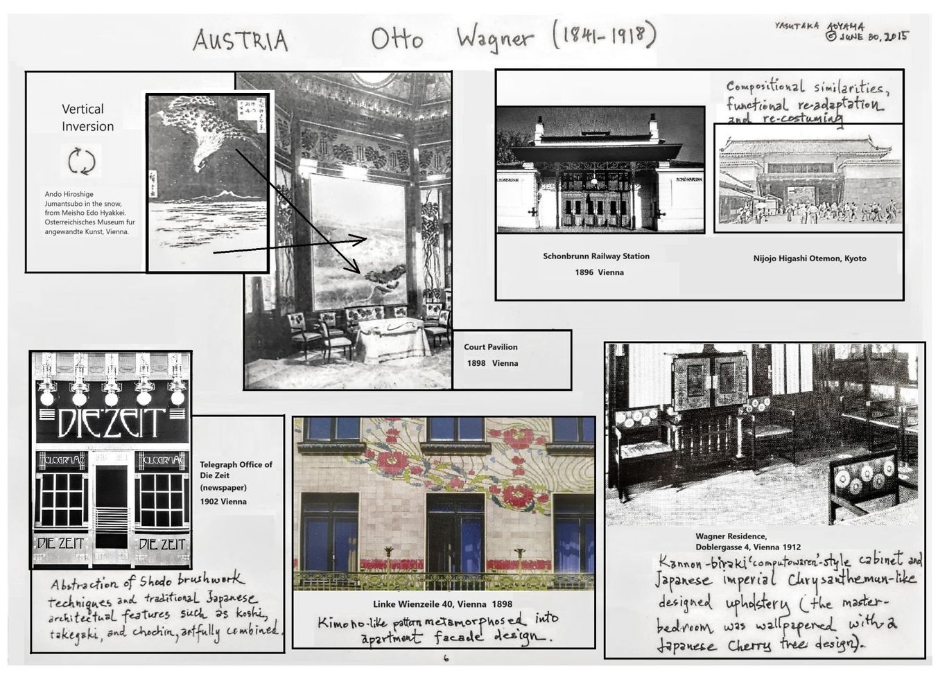
Otto Wagner (1841-1918)
Japonisme as the Epitome of Elegance in a Pioneer of Modern Architecture
Lecture handout scrapbook format 2015.6.30, Architectural Juxtapositions, p. 36
Yasutaka Aoyama
"...our sense must already tell us that the lines of load and suppport, the panel-like treatment of surfaces, the greatest simplicity, and an energetic emphasis on construction and material will thoroughly dominate the newly emerging art-form of the future."
Otto Wagner, 'Concluding Remarks' in Modern Architecture, 1896
Otto Wagner's Modern Architecture was a prophetic statement of modernist ideas, and would be echoed in the writings of Adolf Loos and Le Corbusier and in other proclamatory tracts on modern architecture. In Wagner's lines above, it is clear to anyone with a knowledge of Japanese architectonic and constructional principles that those comments are also a perfect description of the fundamentals of traditional architecture in Japan. Otto Wagner was immersed in the japonisme influenced milieu of the Vienna Secession, and his works reflect, albeit in a a masterfully subtle way, the aesthetics of Japanese art and architecture.
As curator of the MAK (Austrian Museum of Applied Arts) Johannes Wieninger writes (in the superbly organized Japonisme in Vienna, 1994), regarding the impetus away from classical styles in Viennese design in the late 19th century, Wagner "is most likely to have been the first one to aim a pointer in the direction of Japanese art. Indications of an artistic nature exist to document this. In his first villa in Hutteldorf, built in 1886, Otto Wagner used Imari vases for the exterior, and put heavy, Meiji-period bronze vases in two large facade niches, which had in fact been intended for sculptures. ... To see in Otto Wagner the first great Japoniste is certainly to exaggerate. But his freer treatment of the European historical vocabulary of forms brought about a drastic atmospheric change, which instilled the young generation of artists in his vicinity with their creativity." ("A Europeanised Japan" Reflections on "Japonisme in Vienna" in Japonisme in Vienna, p. 205.) We might add that to see Otto Wagner as the first great Japoniste is to exaggerate; but to see him simply as a great Japoniste is not at all---and quite apropos.
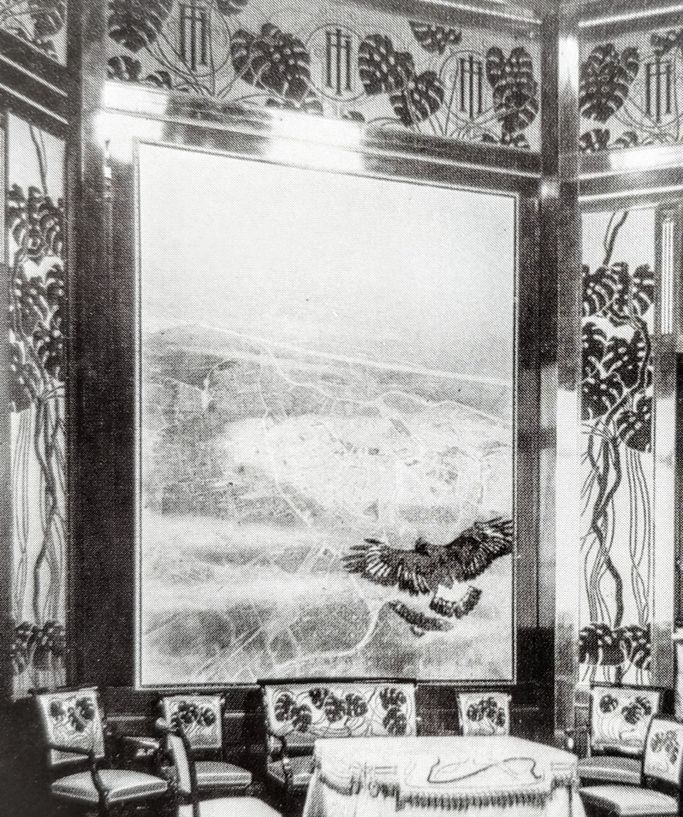
Postal Savings Bank
The Postal Savings Bank (1903-1912) conference hall. Here Wagner artfully blends 'japanned' built-in cabinets with a byobu screen style painting of Emperor Franz Joseph wearing an almost kimono-like robe in rich golds and starkly contrasting red and black.
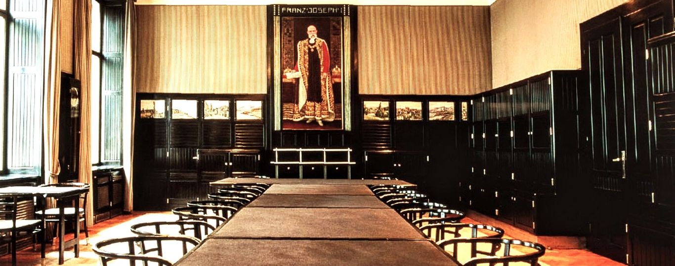
Let us recall that connected, extended cabinetry, part and parcel of the walls, was an adoption of Japanese interior ideas, and that lacquering furniture black was, like the practice of creating jet black lacquered pianos, also a result of the study of urushi techniques. That influence extends back to the 17th and 18th centuries, when lacquered cabinets were imported into Europe and graced the halls of the German speaking aristocratic and wealthy, as elsewhere in Europe.
Villa Wagner I and Wagner's Kostlergasse Residence
Other aspects of what we might call the 'discreet japonisme' of Otto Wagner. Left: Villa Wagner I (1886) with its shallow sloping and extended eaves with painted undersides characteristic of Japanese Edo period buddhist temple architecture. The four ornamental roof supports over the entrance area also echo Japanese religious architecture. Right: Wagner's city residence, Kostlergasse 3, bedroom wall paper, in classic Japanese style outward 'groping' twigs with ample empty spaces between them. Wagner may be said to be one of the most successful architects in creating an elegant blend of Japanese and Western (and at times Persian) architectural elements.
Shown below is Villa Wagner, extended and painted eave undersides with the four ornamental supports, followed by the painted eaves and four ornamented supports of the 'sanjunoto' (3 level pagoda) of Shinshoji Temple, Chiba prefecture (1712). The style became popular in Japan from the early 18th century, as Buddhist temples sought ways to attract more believer visitations as state patronage waned. This kind of decor was called the 'nokimiage', or literally 'looking up at the eaves'. Wagner also followed the concept in making sure that the visitor would naturally look up at the eaves as he approached, climbing the relatively steep stairs facing the house, making sure the visitor would repeatedly view the painted eaves by angling the next set of stairs parallel to them.
Above Villa Wagner, below Shinshoji Temple.

Vienna Osterriechisches Museum fur angewandte Kunst
Left: one of Ando Hiroshige's most famous prints, also at the Vienna Osterriechisches Museum fur angewandte Kunst. Right: Court Pavilion interior, Vienna. A possible case of image 'inversion', a standard technique of modifying the original image by European japoniste artists.
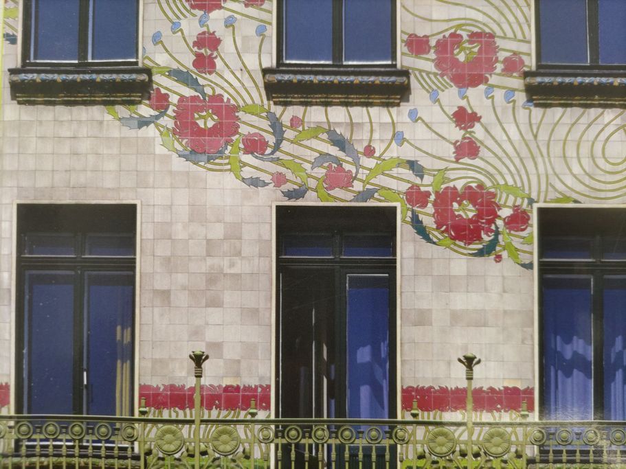
Majolikahaus
Left, Majolikahaus, Vienna, 1898. Right, Old Imari porcelain, Drick-Messing Collection, c. 1700. Note the extending floral design guided by diagonal lines and smaller budded stems extending diagonally outward (in Wagner upward, in the Imari downward) from the larger flower blossoms, and even the interspaced 'railing poles' ending in bulbs (in Wagner it takes the form of a real rail beneath the wall design) in both. Such patterns were typical of both kimonos and porcelains from Japan, prized by German princes in the first half of the 18th century.
Wagner designed stool
left to right: Two examples of traditional Japanese 'taka-ashi zen' or 'ai-seki zen', followed by a Wagner designed stool, an opened up Japanese picnic box. These sorts of items were often displayed at the world expositions of the 19th century. A photo by M. Moser of one of the Japanese exhibits at the Vienna Exposition of 1872 is shown last extreme right. Though the photo is rather damaged, one can clearly make out the same kind of taka-ashi zen upfront, centrally placed.
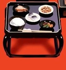
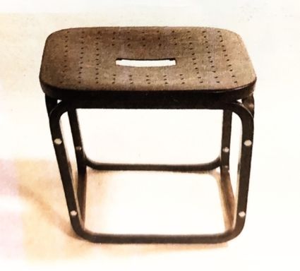
The method of connecting the legs and lacquering them black is standard Japanese furniture construction, prevalent because eating, sleeping, etc. was on raised, clean floors, as opposed to Europe, where furniture was raised high away from the ground, and minimal furniture contact with the floor preferred. A classic case of what I call 'functional re-adaptation', from table to stool (just as chopsticks have been used as a hair pin in the West), one of the standard techniques employed by japonisme influenced artists.
________________________
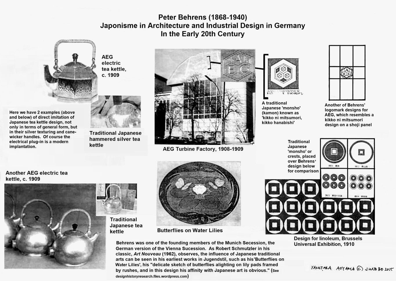
Peter Behrens (1868-1940)
Early 20th Century Japonisme in Architecture and Industrial Design in Germany
Lecture handout 2015.6.30, Architectural Juxtapositions, p. 43
Yasutaka Aoyama
”Peter Behrens (1868-1940) was another of the more important Munich artists to draw inspiration from Japanese objects. The founder of the Vereinigten Werkstätten (United Workshops) in 1897, Behrens, like Eckmann, had also started his career as a painter and designer, then turned to the applied arts, where he chiefly designed carpets and furniture, and at last arrived at architecture, a field in which his work carried him far beyond Jugendstil into the realms of what can be called the modern art of building. His earliest works in Jugendstil are ornamental drawings like the delicate sketch of butterflies alighting on lily pads framed by rushes [shown below left], and in this design his affinity with Japanese art is obvious. ... The color lithograph, The Brook [shown below right], shows a highly abstract stream in the flat Japanese style flowing between tree trunks and framed by large leaves.”
---Robert Schmutzler, Art Nouveau, 1962, 1977 abridged edition, p. 153


Photos from R. Schmutzler, Art Nouveau, 1962, 1977.
Note also the signing in the Japanese ukiyo-e print style of lettering within a block, barely visible in the lower center of the water lilies sketch, and more distinct in The Brook, found in the lower left of the lithograph, nestled among the leaves. The butterfly sketch looks very much like it was based on a Japanese lacquer 'o-bon' tray; while one of the brook appears to be a melange of katagami-type patterns and a central image that once again is reminiscent of lacquerware iconography.
Peter Behrens surely must be included among those German architects influenced by Japanese design including that of lacquerware, but especially monsho crests, katagami patterns, and metal crafts. His interest in Japanese arts and crafts was especially strong in the 1890's during his years in Munich, and he himself owned ukiyo-e prints. (Behrens bio in Katagami Style, 2012, Mitsubishi Ichigokan Museum, eds., supervised by Mabuchi A.)
_______________________
Auguste Perret (1874-1954)
Lecture handout 2015.6.30, Architectural Juxtapositions, p. 44, revised 2024.5.23
Yasutaka Aoyama
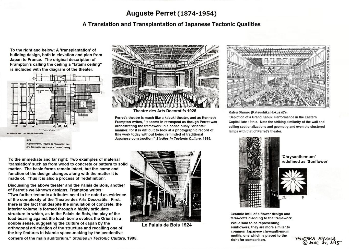
The following text added 2024.9.17.
The same kind of Japanese architectural characteristics of the repeating grid, whether reminiscent of the shoji (the gridded sliding screen door) or gotenjo (ceiling with gridded with interlocking framed square panels) or tatami (interlocking rectangular floor mats), in combination with finer inconspicuous Japanese decorative elements, is seen also in his façade design for the Garage rue Ponthieu, Paris (1905), one of his best-known buildings.
At first glance, from a distance, the large, dominating central cathedral rosette-like window does not give a Japanesque impression to the viewer. But that is the same with his apartment house on rue Franklin, Paris (1903) as well; it is only when one looks at the details of it close up that one sees distinctly Japanese decorative motifs embedded into the design (e.g. the example above of the sunflower/chrysanthemum motif that is distributed on the exterior of the rue Franklin apartment). The central rosette-like window glass panels of the rue Ponthieu facade, on closer examination, each section varying in the glass texturing, is analogous to Japanese kumiko (extremely intricate geometrically patterned wood fretwork) that is fitted into shoji screens, where the larger, thicker koshi (framing wood pieces) section off different types of kumiko patterns.
In other words, the whole front façade design is analogous to a giant shoji screen in which one fourth or so is often devoted to complex kumiko. Particularly in the early Meiji period, shoji designs started to veer off in varied directions in terms of composition and patterns though these are unfamiliar to most Westerners as well as to present day Japanese. Shoji came to be designed with a variety of whimsical motifs or shapes such as spiderweb designs, more centrally placed in the screen. While the intricate design of Perret's stained-glass windows of his Notre-Dame du Raincy may seem more Islamic or Indian in its ornamental style, and either may have been the greater influence there, for the works discussed here, and in his other works besides the church of Raincy, the composition of the gridwork along with other aspects of his designs are more akin to that of Japanese architecture.


Below is a limited sampling of shoji and ranma designs. These sorts of grids and patterns covered extensive 'wall' surfaces, with a wrap-around effect reminiscent of Perret's designs. Note that these pattern variations, numbering in the hundreds, if not thousands, usually had established names. This is something that indicates the traditional and widespread nature of this type of designing in Japan; what was commonplace in one culture may be celebrated by its novelty and rarity in another as modern and avant-garde.
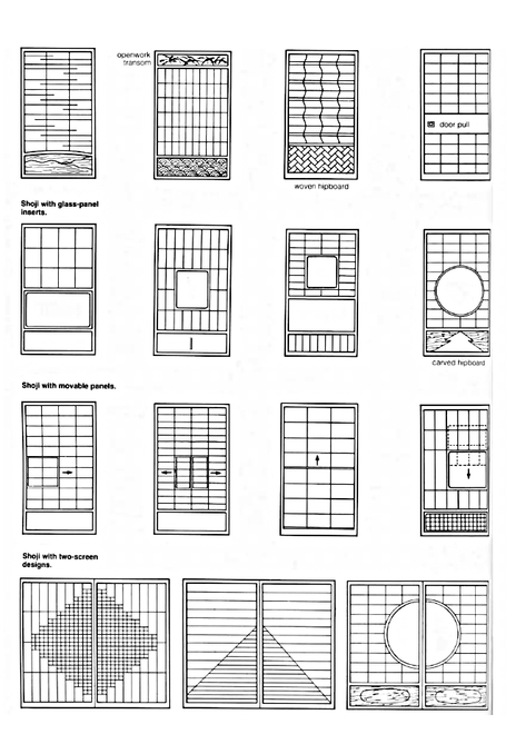
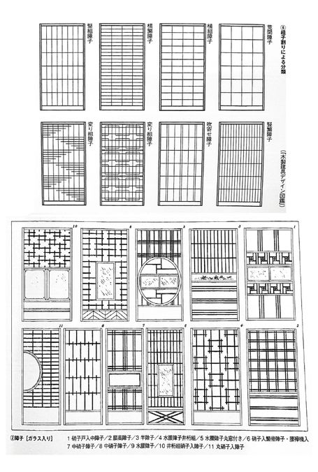
Photo captions and sources to be added.
________________________
Edward William Godwin (1833-1886)
Anglo-Japanese Precursor to De Stijl
Prepared 2015.11.23, Architectural Juxtapositions, p. 45
Yasutaka Aoyama
Key Points of Comparison
Left: Japanese traditional furniture, with 'chigaidana'. Right: Godwin furniture, in chigaidana style.
Below left: Kinkakuji upper level vs.top section of Godwin cabinet. Right: Japanese outdoor tea furniture with top section of Godwin desk.
Godwin's Art Furniture Designed by Edward W. Godwin
Title page of Art Furniture Designed by Edward W. Godwin, second edition, 1878. Note on the left (the back cover) the lady in the kimono, the chochin lamp from the ceiling, the 'koshi' gridwork high above, the 'karahafu' style arch, the thin 'hikido'-like walls (next to the kimono clad woman) and the gradations of floor height as at the Katsura Villa of Kyoto. To the right (the front cover) Japanese fans, cranes, and bamboo branches create a japonaiserie effect.
________________________
Uploaded 2023/5/10
Dante Gabriel Rossetti (1828-1882)
Kitagawa Utamaro (1753-1806) and the Pre-Raphaelite Discovery of a New Feminine Ideal
(The Wider Aesthetic Context of Architectural Japonisme)
Lecture handout 2015.10.12, and in Architectural Juxtapositions p. 36, site material added 2023 May, and 2024.5.26
Yasutaka Aoyama
"Rossetti was equally astonished and delighted with Japanese designs; their enormous energy, their instinct for whatever savours of life and movement, their exquisite superiority to symmetry in decorative form, their magic of touch and impeccability of the execution, carried him away."
William Michael Rossetti (Dante Gabriel's brother, in Some Reminiscences, vol. 1, London 1906, pp. 276-7)
While it is well-known that Dante Gabriel Rossetti and his circle of fellow aesthetes were keenly interested in Japanese art, in exactly what manner they incorporated those artistic principles is often left unmentioned. Indeed, British and Japanese discussions of Rossetti's japonisme usual conclude that the influence of Japan was limited to merely superficial aspects of his work, such as depictions of kimono fabrics in "The Beloved" or his Japanese style book bindings. Part of the reason is due to his brother William Michael, who, after recounting his brother's passion for Japanese art, was quick to add detracting comments and deny any serious Japanese influence:
"Assuredly, he did not suppose that the facial angle of the 'eternal feminine' of Japan, as represented (and very untruthfully represented) by her admiring countrymen, is to be accepted as the line of beauty; nor were his previous impressions revised as to how a human leg or arm or torso is constructed...Upon the colouring of the prints he looked with great satisfaction, as having qualities of force and saliency which no other nation could bring into play with equal effect; he said, however that the colouring is somewhat harsh -- which is true of a large number of Japanese works, though not of all."
William Michael Rossetti, Some Reminiscences, pp. 276-7)
Let us take a more considered look at that seemingly knowledgeable appraisal, which in fact is rather rhetorical in tone and somewhat contrived (if one knows a thing or two about ukiyo-e prints). Does not one receive the distinct impression he is trying to make light of any Japanese influence, even mocking what he calls "very untruthfully represented" female faces drawn by Japan's own "admiring countrymen"?
His point about Gabriel Rossetti's ideas of how to construct a human leg, arm, or torso being unaffected by Japan--yes this is most likely true--but how relevant is it? What about the emphasis on the neck and especially the female hand--which he leaves out--that came to play a prominent role in Rossetti's paintings? As for the rest of the body, since his figures were often richly draped, thus hiding (as in ukiyo-e prints) those other bodily constructions anyway, why bother to mention what doesn't really matter? And as for the harsh coloring, that is also misleading. The darker and brighter coloring was a latter trend of ukiyo-e art, from the mid-19th century onward due in good part to the introduction of European inks. In any case, everything indicates that Rossetti was interested in earlier prints, especially those of Utamaro, whose colors are softer and subdued--indeed, it might be said more so than those of Rossetti himself.
Thus there seems to be something of a mismatch here: on the one hand, unrestrained enthusiasm for Japanese art expressed by Dante Gabriel Rossetti and conveyed to us by his brother William Michael, an admiration so exuberant as to be still fresh in his brother's memory; and on the other hand, attempts, now many years later, at subtle mockery and contrived arguments against that object of admiration, with the effect of casting cold water on any notion of possibly meaningful influence.
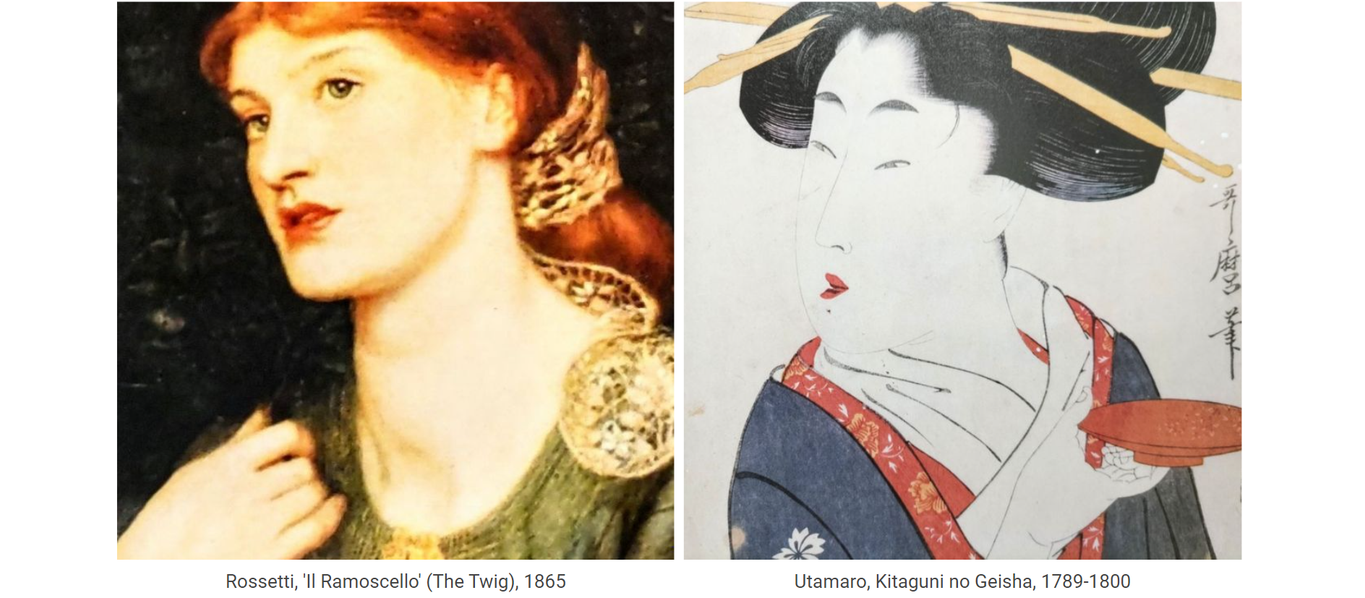
Utamaro's 'Yoshiwara Suzume' (c. 1793-94) and Rossetti's 'Il Ramoscello' (or The Twig, 1865)
A prolonged look at the two pictures below should dispel any doubts as to whether Rossetti's enthusiasm for Japanese prints extended to their compositional features as well as to the expression of aesthetic ideals. Quite clearly it did. Regard first the peculiar, soft, languid depiction of the crossed hands, not only the pose and the fingers, but in the fleshy lengthened palms relative to the fingers, and without much surface detail. Just as important is what cannot be seen--the cutting out of view of the elbows and arms in the same manner and at the same locations in typical ukiyo-e fashion. Next note the delicate, intricate flower patterns in yellow-gold emphasized on the left shoulders, one on a fan, the other in a filagree ornament. Chromatically, it is clear how the schema of olive greens, golden yellow, black, and orange-reds in Utamaro are shared with Rossetti, if in different proportions for different features. (In fact, olive green, yellow, orange-red and black were the standard colors used in the earlier benizuri woodblock prints.) Both figures fill much of the picture in ukiyo-e style, with near monochrome backgrounds which enhance a sense of singularity and closeness of presence. Even small details have their parallels; Rossetti has a Japanese 'inkan' style stamp in the upper left-hand corner, and writing on both edges of the picture;--it was not until the introduction of Japanese art that Western artists would conceive of signing or labeling their paintings in that way, boldly at the top of the canvas. There is even something of Utamaro (as found in his other 'bijinga' pictures) in the manner of Rossetti's lips here. The keen observer will note further parallels. The fan has been replaced by a twig, but one wonders, why a twig? It does seem somewhat odd does it not (that perhaps, an infrared scan of the painting might reveal traces of a folded fan sketched, but then considered too much of a give away and painted over as a twig)?
Utamaro's 'Tosei-odoriko-zoroe: Yoshiwara Suzume' (当世踊子揃: 吉原雀) and Rossetti's 'Il Ramoscello' (The Twig)
There are affinities between Rossetti's woman and those of other Utamaro bijin as well. His picture is in one sense, though relying fundamentally on the Suzume above, a composite of Utamaro style femininity. Note, for example, in the comparison below the similar loose hold of the lips and the hands, both conveying a peculiar lack of muscle tension and strength...
Utamaro's 'Hyakkaen Suzumi' (late 1780's), other Bijinga, and Rossetti's 'The Beloved' (1865-6)
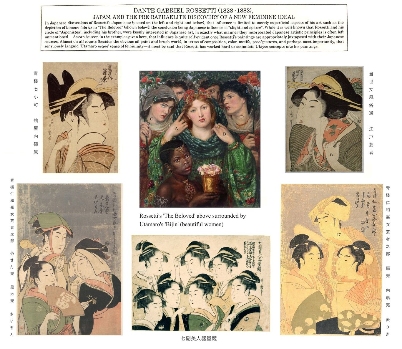
Rossetti's 'The Beloved', surrounded by various Utamaro bijinga prints for comparison of hand and neck poses. Clockwise from the upper right hand corner: 1) Toseijo Fuzokutsu, Edo Geisha (当世女風俗通, 江戸芸者); 2) Seiro-niwakaonna Geisha-no-bu: Ogiuri, Uchiwauri, Mugitsuki (青楼仁和嘉女芸者之・ 扇売, 内扇売, 麦つき); 3) Shichifuku Bijin Kiryokurabe (七副美人器量競); 4) Seiro-niwakaonna Geisha-no-bu, Chasenuri, Kurokiuri, Saimon (青楼仁和嘉女芸者之部: 茶せん売, 黒木売, さいもん); 5) Seiro-nanakomachi, Tsuruyauchi-shinohara (青楼七小町・鶴屋内篠原).
Compare A to those marked A'; B to those marked B'; and so forth. Note how Utamaro often has, among his clusters of beauties, one woman slightly to the back with an angled neck holding some object as in C' and D' just as Rossetti has his beauties C and D, standing similar placed a shoulder behind, each holding a stem of flowers. Dozens of other examples could be provided of Utamaro poses analogous to those of Rosetti's. The Twig and The Beloved are simply two examples of what can be found in other Rossetti portraits of women, where parallels like the ones discussed here, as well as other correspondences with Utamaro are to be found. There are other aspects of japonisme in his work, and even the original picture frames for Rossetti's pictures often have monsho (Japanese crest)-like patterns on them.
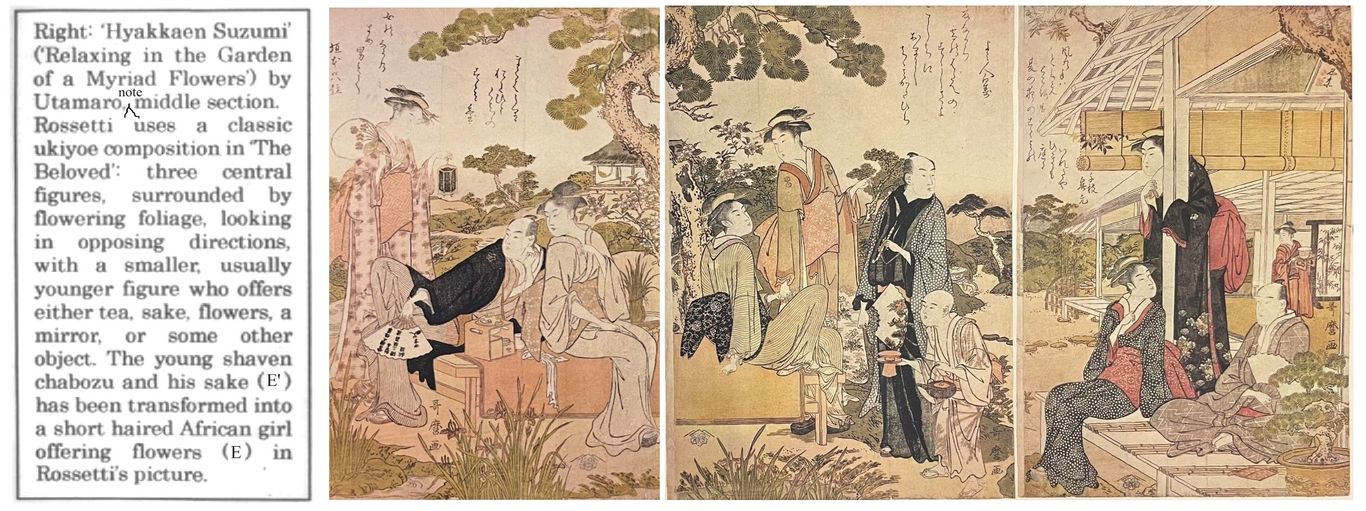
Utamaro's 'Hyakkaen Suzumi', again in greens, yellows, orange-reds and black, with some brown in the branches; necks bent in various directions; a boy presenting them with tea on a tray, his head at a much lower level (sections and illustrations modified from Aoyama, Architectural Juxtapositions, 2016). While the figures in the Hyakkaen Suzumi are distributed along three panels of a triptych, the various figures often mirror the kind of hand and neck poses that we have been highlighting in this discussion. Both paintings are of floral gardens, though only plucked flowers and stems are visible in Rossetti. Other Utamaro prints may be of interest when considering 'The Beloved', such as 'Furyu-uta-no-kayu Hagidera (late 18th century).
Below: Close-up of the corresponding section of 'Hyakkaen Suzumi' and 'The Beloved' pointed out above.
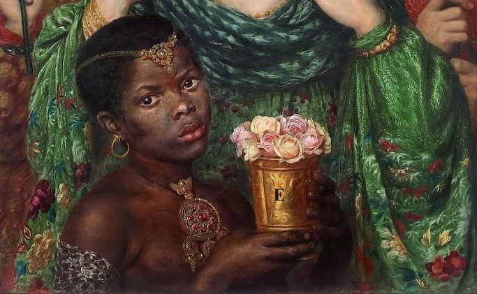
Like the green kimono which The Beloved wears, the Japanese element has been sufficiently modified so as not to be readily recognized. Yet like the kimono, those elements can be discerned, if scrutinized carefully.
Text to be added.


")

The following added 2024.9.14
In his section 'The Japanese Style from Rossetti to Beardsley', speaking first of Whistler, Robert Schmutzler, well-known historian of Art Nouveau, writes:
“Rossetti’s interest in Japanese art, not being quite so one-sided, attracted less attention. Yet, in 1865, Rossetti also dressed one of his voluptuous feminine figures, The Beloved, in a rich gown embroidered with Japanese bamboo leaves; moreover, this fair and utterly English bride illustrating the Song of Songs wears in her hair a fantastic Chinese ornament made of gold and red enamel. Stimulated by Whistler, Rossetti, in the sixties, also began to collect Chinese porcelain and Japanese woodcuts. Long before Whistler and Morris thought of illustrating books, Rossetti thus designed in 1865 the binding for Swinburne’s drama, Atalanta in Calydon, in Japanese style, so that by virtue of its striking binding alone the book would attract the attention so greatly needed by the still unknown poet.
The balance of this design, its effective use of space, the circular ornaments arranged near its edges, the theme of the two disks partly covering each other, and of the peacock feathers with their contrasted curves, are all inspired by Japanese lacquerware.
Did this bookbinding have an immediate influence? It strikes one as too alien to its period, though not to Rossetti’s art. With the frame for Ecce Ancilla Domini, Rossetti had indeed come surprisingly close to the Japanese style on his own, even though the specific flavor of the latter was still lacking. But this binding design has such a flavor, as well as the delicately worldly elegance that belongs to all English creations in the Japanese style which later influenced the more cosmopolitan or metropolitan style of Art Nouveau.”
---Robert Schmutzler, Art Nouveau, 1977, pp. 25-26
Anyone with lingering doubts about Rossetti's japonisme should also read Tanita Hiroyuki's papers: 'A Note on Rossetti's "Hoxai", ' The Journal of Pre-Raphaelite Studies, Nov. 1985, vol. 6, no. 1; 'An Introduction to the Study of Japanism in Great Britain, 1851-1862' (Japanese), Hikaku bungaku nenshi (Waseda Univerisity), 1986, no. 22; and 'Ancient Greece and Japan---An Aspect of Japanism in Great Britain' (Japanese), Sansai, 1988, no. 494.
________________________