ジャポニスム・ミュージアム・ニュースレター
The JAPONISME MUSEUM Newsletter
Back issues in descending order, most recent to earliest, except for sequels and series on a particular theme
Renoir's Japonisme: In the Frosting and Filling of his Art / From 'Kogei' Aesthetics to an Implicit Philosophy of 'Wa'
The Japonisme of Beams, Rays, and Streaking Bullets: Utagawa Yoshitsuya's Hyogundan & Marvel Comics' Fantastic Four. March 2022.
Japonisme Micro-Analysis: Pinpointing Correspondences and Brush Stroke Details in Monet's 'L'Hotel des Roches Noires' vs. Sadahide's 'Totsuka' and the 'Suehiro 53 Tsugi'. December 2021.
The 'Gaping-Monster-Mouth Entrance' as a Backdrop for Fallen Heroes, A Case of Horizontal Inversion: Marvelous Utagawa Yoshitsuya vs. Marvel's John Romita, Jr.――The Influence of the Lesser Known Utagawa School Artists. September 2021.
Explaining the Mechanics of Japonisme Influence: Inversion and Reversal: 'Flipping' Utagawa Kuniyoshi in Marvel's X-Men (with a discussion of Charles Rennie Mackintosh). May 2021.
Exhibiting Japonisme (with articles on: 'Tea Ceremony Aesthetics in the Texture of Abstract Art: Cross-cultural & Trans-media Influence' and Kawabata Yasunari and Mark Tobey photos and commentary). January 2021.
Two part series on Metonymy and Magnification
The Japonisme of Metonymy and Magnification, Part I: Utagawa Kunisada and Marvel’s X-Men――The Ukiyo-e ‘Giant Face’ and its Impact on Comic Cover Designs. June 2020.
The Japonisme of Metonymy and Magnification, Part II: Utagawa Kuniyoshi and Marvel’s X-Men with Reflections on 'Languages of Art'. September 2020.
Three part series on Ishinomori Shotaro
Manga Japonisme in the Making of the Cosmic Superheroine: Ishinomori Shotaro’s ‘Yuki Onna’ vs. Marvel Comics’ ‘Storm’. October 2019.
Family Resemblances and Artistic Extrapolation in ‘Monster Japonisme’: Ishinomori Shotaro’s Cyborg 009――A Model for Marvel’s Reformulated X-Men. December 2019.
Ishinomori Shotaro's Mutant Sabu and Marvel Comics's X-Men: Obliqueness, Softness, and the Early Japonisme of Manga-style 'Kawai'. March 2020.
Ukiyo-e Imagery in the Making of the Comic-Book Superheroine: Suzuki Harunobu’s Billowing and Bounding Beauties & Depictions of Female Power in Marvel Comics. August 2019.
Two part series on Torii Kiyomasu
Torii Kiyomasu’s Early 18th Century Mid-Action Poses in American Comics or Japonaiserie as Overlay / Japonisme as Underlay. April 2019.
The Evolution of Torii Kiyomasu’s Bursting-Through-Barrier Theme: Breaking Through to Other Worlds and the Japonisme of ‘Impact Splotches’ in Form and Color. June 2019.
Three part series on Katsushika Hokusai
Hokusai’s Earth, Wind & Fire in Marvel Comics’ X-Men, Part I: Direct vs. Indirect Transmissions of Supernatural Force and Energy. October 2018.
Hokusai’s Earth, Wind & Fire in Marvel Comics’ X-Men, Part II: Fiery Apparitions in Looming Fire or The Iconography of Combustion. December 2018.
Hokusai’s Earth, Wind & Fire in Marvel Comics’ X-Men, Part III: Blasting Earth and Blinding Light; Japonisme as Big Bang Theory of Comic Art. February 2019.
Japonisme in American Comics: Tezuka Osamu's 'GARON' vs. Marvel Comics' 'GAROKK'. August 2018.
A copy is also available at https://archive.org/details/037_20260528
Uploaded 2026/5/28
The JAPONISME MUSEUM Newsletter, Special Edition, May 2026
ジャポニスムミュージアムニュースレター特集号2026年5月
Renoir's Japonisme: In the Frosting and Filling of his Art
From 'Kogei' Aesthetics to an Implicit Philosophy of 'Wa'
On the 2nd page of this website: 'Renoir's Japonisme'
ルノワールのジャポニスム
当サイトの2ページ目「Renoir's Japonisme」に掲載しております。
Uploaded 2021/10/18, revised 2026/4/12 after report of website attacks
A Youtube version of this edition was once available at: https://www.youtube.com/watch?v=f3I0gQlDksE
March 2022
The Japonisme of Beams, Rays, and Streaking Bullets
Utagawa Yoshitsuya's Hyogundan
&
Marvel Comics' Fantastic Four
Yasutaka Aoyama
In previous issues of this newsletter, we have discussed in some detail the connection between Marvel Comics' X-Men and a variety of ukiyo-e artists. But the choice of comparisons could have been made with any of the other Marvel Comic superheroes.
This time we will chose different Marvel superheroes from the Museum collection---The Fantastic Four. More specifically, The Fantastic Four March 1979 issue (216) of the series. We should note that more recently, that is in the 21st century, other Marvel characters have been more frequently taken up in film, but in its day The Fantastic Four was one of the most popular, perhaps the most popular, of the Marvel comics.
We will be looking at the cover design and comparing it to a Japanese ukiyo-e print. The Marvel cover was done by Rich Buckler (1949-2017) and Al Milgrom(1950-), two veteran Marvel cover designers. It depicts the four superheroes being attacked by a 'super-evolved' being, right in the middle of Manhattan's Times Square. The ukiyo-e print is by Utagawa Yoshitsuya (歌川芳艶 1822-1866), a late Edo/early Meiji period artist, who was a source of ideas and compositional modeling for other Marvel comic-book illustrations as well (see Museum Newsletter, Sept. 2021). Here we examine his 'Masamori on Horseback, Attacking Hisayoshi Singlehandedly' (正盛一騎久吉を襲ふ), the 47th scene out of the Hyogundan 54 Scenes (瓢軍談五十四場), published in 1864, the Edo Period. It depicts the life of one of three great generalissimos of feudal Japan, Toyotomi Hideyoshi, also called Hisayoshi.
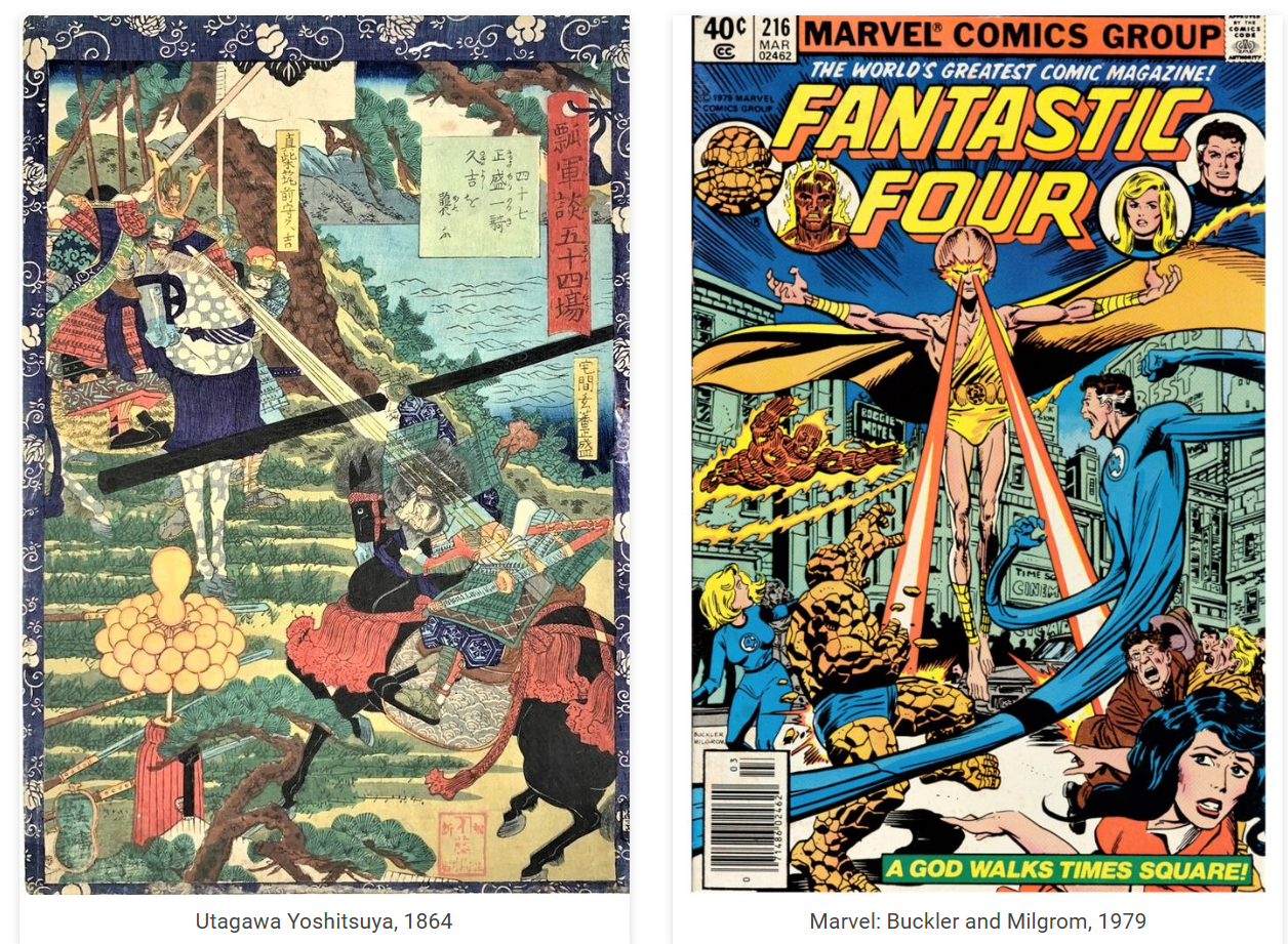
Yoshitsuya and Marvel's images could hardly be more different in setting and subject matter, but as we shall see, they are compositionally and conceptually quite alike. But before going into a close look at the two images, some background in Japanese art is necessary.
For already in more early Japanese art before the Edo period, the depiction of a clustered beam, or two narrow and sharp, slightly widening beams, emanating from an individual's face or eyes, and directed towards another individual, was a common artistic motif with its origins in medieval Japanese buddhist paintings of the Amida Buddha's 'raigo' (来迎), the Amida's 'coming and welcoming' of a person's soul to paradise, or otherwise sudden appearance to impart truth to a holy sage, as in the images below.
The two paintings below are from 'emaki' or picture scrolls, dating back to the early 14th century, of the Yuzu Nembutsu Engi (融通念仏縁起), depicting the life of the priest Ryonin (良忍). The image to the left is from a scroll at the Chicago Art Institute, and the image to its right is from one at the Cleveland Museum of Art (both acquired in 1956 from private American collections).
And even here, we find similarities with the 'super-evolved' Marvel character---he is rather oriental looking, monkish and shaven, and likewise floats in the air and shoots beams from his eyes. Since Japanese picture scrolls were brought over to the US before and after WWII, Marvel's artists may have taken a hint from them, along with ukiyo-e prints from a later age. For although rays of light are found in traditional Christian painting, they do not emanate as concentrated beams from the head or eyes, shooting for such long distances targeted towards a single individual, like that found in Japanese religous painting, and definitely not like that in ukiyo-e battle scenes.


These Buddhist images were incorporated by ukiyo-e artists in the 19th century into purely secular narratives, where the beams no longer represent the transmission of grace or enlightenment, but the striking force of aggressive power. Now moving to our comparison of Marvel and the ukiyo-e artist Yoshitsuya's print, we see in Yoshitsuya that the rays have the effect of a laser-like weapon. The opponent ducks to avoid them, as do the characters in the Marvel comic cover.
Taking a hint from the vocabulary of cognitive linguistics, this image schema, or otherwise what we might call an 'image package', of a character shooting down rays from his eyes against a cowering enemy, is something that ukiyo-e artists developed, and is fundamentally the same package of visual conceptions that appears in American comics later in the 20th century.
We should also point out that placing the canvas upright was reserved mostly for portraiture and still-life, and that the vast majority of battles scenes in the West were horizontally oriented, i.e., wider than taller. That influence may have extended to artists such as Delacroix, among other mid to late 19th century European artists. Whatever the case, such Japanese woodblock prints were ideal models for comic covers, which are also vertically oriented.


Let us zoom into some details of the Marvel and Yoshitsuya pictures. Note first in the picture by Yoshitsuya, how Hisayoshi (Hideyoshi), in the upper left of the picture, sits astride his long-legged horse, which accentuates the height from which the beam angles downward. That effect is paralleled by Marvel's 'super-evolved' being with extra long, horse-like legs, which in like fashion, allows the downward angle of the beams to be emphasized.
A second point of interest, structurally speaking, is how Yoshitsuya's rays cross perpendicularly with the giant black club of the opponent, which stretches across almost the whole width of the picture, creating a pleasing visual effect. That is paralleled in the Marvel image by the rays intersecting with the stretching blue body of the Fantastic Four hero, creating a similar kind of compositional interest from intersecting lines. We have inserted something like Yoshitsuya's black club onto the comic cover so that the structural parallel between the two images becomes more apparent.
Thirdly, we can see in both images the ducking movement of targets of the beam. In Yoshitsuya, the figure ducks under the black club; in Marvel, he ducks under the extended body of the Fantastic Four's Mister Fantastic. A red arrow has been added to both pictures to point out the parallel.
Thus, as we have seen in previous issues of this newsletter, Marvel's cover seems to incorporate features of the original Buddhist paintings and the later ukiyo-e adaptations of them, once again illustrating the possibility of both 'direct' and 'indirect transmission' of older Japanese artistic motifs to modern comic imagery.
While there are many fine depictions of armies clashing in the West from time immemorial, the vivid techniques of combat portrayal found in Japanese art are another story. Laser-like beams shooting out from the eyes, or someone radiating from his body a bomb-like blast of supernatural energy wreaking havoc on the surroundings (e.g. Hokusai), or war scenes with streaking red/orange bullet lines zapping across the whole picture (as depicted below, and this before the invention of tracer ammunition)---these and various other imaginative ideas were something that the West would have to wait for until the opening of Japan in the late 19th century, and their adaption into comic action scenes would not happen until well into the 20th century.
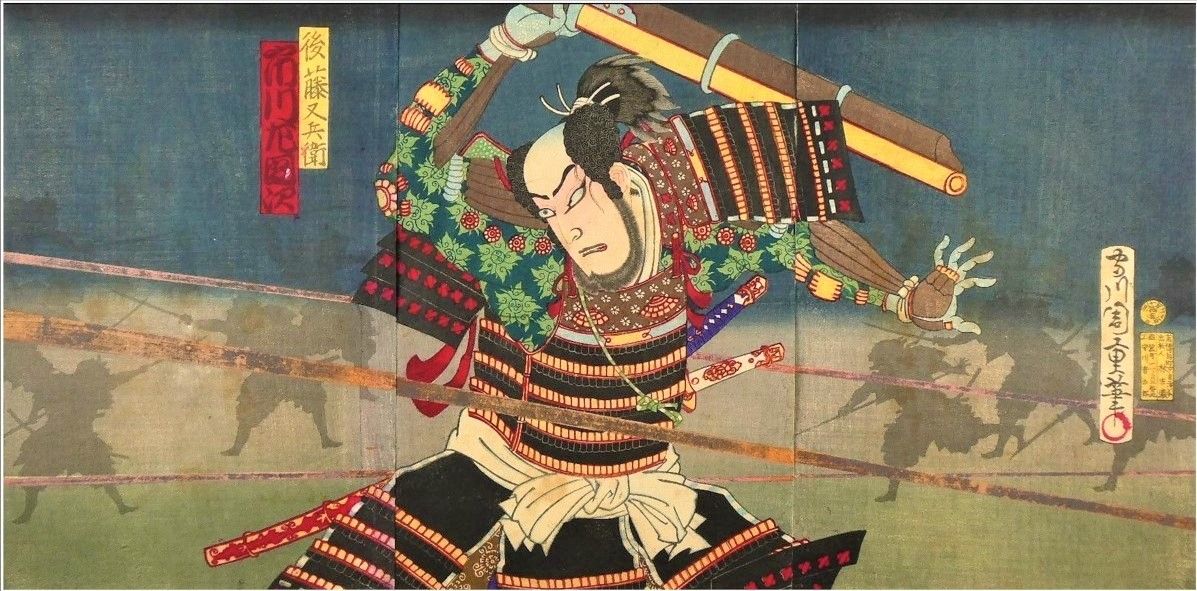
The Museum's exhibit with the following caption in Japanese, touching upon the ideas discussed above:
守川 周重 Morikawa Chikashige
「茶臼山凱歌陣立 後藤又兵衛 市川左團次」 木版画 三枚続 明治前期 (1870年代~1882年頃)
周重は豊原国周の門人で、作画期は明治2年頃から明治15年頃までである。この絵には鮮やかなオレンジ・金・黒の飛び交う鉄砲弾の火の線がもともとあったが、経年で薄れてしまっている。それでも今も迫力満点の傑作といえる。これは肉眼では見えない弾丸を、まるでスローモーションで見えるかのように、作り出された日本の描技であり、発光する近代的な曳光弾の発明以前に描かれたのが驚きである。現代の日本漫画・アメコミにこうした弾丸や光線の描法は今では一般的になったが、そうした一瞬で終わる爆発や光線や雷の表現方法を築いたのが、北斎に次いで国芳や芳年と、その門人と門人の教え子周重の絵師たちであった。
***********
Uploaded 2021/10/14, revised 2023.9.20, 2024.5.6
Transferred to 'Japonisme Insights into Modern Painting' 2024.8.27
December 2021
Japonisme Micro-Analysis
Pinpointing Correspondences and Brush Stroke Details
Monet's 'L'Hotel des Roches Noires' (1870)
vs.
Sadahide's 'Totsuka' and the 'Suehiro 53 Tsugi' (1865)
Yasutaka Aoyama
***********
September 2021
The 'Gaping-Monster-Mouth Entrance' as a Backdrop for Fallen Heroes
A Case of Horizontal Inversion
Marvelous Utagawa Yoshitsuya vs. Marvel's John Romita, Jr.
The Influence of the Lesser Known Utagawa School Artists
Yasutaka Aoyama
Utagawa Yoshitsuya (1822-1866), a disciple of Utagawa Kuniyoshi, while well-known among students of ukiyo-e art, did not, and still has not, achieved the celebrity status of artists such as Kunisada, Kuniyoshi, and Yoshitoshi of the Utagawa school of ukiyo-e artists. But his haunting images of monstrous serpents, flying ogre heads, and other supernatural phenomenon exude a particular sense of uncontrollable energy and suspense. It is a distinctive imagery whose influence can be recognized in American action comic books of the 20th century.
Indeed, we can inductively glean and posit, from a thorough scanning of both Japanese ukiyo-e prints and modern American comic books, the following realities from at least from the late 1960's: the US comic book industry systematically gathered, and constantly poured over, a wide range of ukiyo-e genres, flipping through and digging into them for both general ideas and specific imagery for their pulp comic fiction panels. And that furthermore, Yoshitsuya, and other lesser known members of the Utagawa school of ukiyo-e artists, were just as likely to be used by major comic-book bullpen art teams as source material for their comic books, along with the work of the more recognized ukiyo-e masters.
Though we could dwell at length on Yoshitsuya's varied contributions to modern comics and painting, here we look at one of his pictures as an example of the technique of 'horizontal inversion', a frequently applied japonisme technique, having in the previous newsletter issue discussed the case of 'vertical inversion'. We have placed below to the right, a panel of Yoshitsuya's triptych print 'Illustration of Princess Takiyasha Bewitching [her Enemies]' (Takiyasha-hime genjutsu no zu 滝夜又姫幻術之図) done between 1847-1852, part of the series Great Japan's History in Full Color Pictures (Dainihon rekishi nishiki-e 大日本歴史錦絵). Mirroring it on the left, is the cover of Marvel Comics' King Size Annual X-Men #4 1980, penciled by John Romita, Jr. (1956- ) with Bob McLeod (1951- ) as inker.


First, taking a quick glance at the two pictures side by side, we see that compositionally, the gaping mouth entrances, which fill much of both frames, are similarily angled, accentuating the sense of mirroring. Of course the most conspicuous parallel between the two pictures is the placing of fallen warriors at the foot of the entrance.
Next, if we look at the coloring, we find Marvel taking cues from, and expanding upon, the patchwork style of mixing light sky/baby blue and navy blues, found in the textile banners within Yoshitsuya's cave with blues scattered in and about the entrance. In Romita's picture, the same color scheme, in terms of chromatic tones and combinations, is applied to the sky above, and rocks below, surrounding the fallen heroes.
We should add that the deployment of ukiyo-e color schemes on a more expansive scale is a common tendency in Marvel imagery, as we saw in the previous issue of this newsletter ( May 2020), where the finer combination of blues and greens of Matagoro's clothing were extended to cover Attuna's entire body.
Now looking more closely, we find Romita's image reveals similar drawing details, such as the darkly drawn inner rim of the gaping mouth and the bulging, protruding eyelids. And while at first glance it may seem that Romita's image of the gaping mouth is different in having fangs, if we look carefully at the Yoshitsuya picture, we find the ragged pieces of cloth hanging down above the female warrior's head do very much suggest jagged teeth, much in the same way that the upright Naginata spear held by that valiant woman appears to have suggested the vertical line in the center of the gate in Romita's picture. Interesting that line does not seem to represent the line between two doors; it is unlike the firm line of the rim of the rock entrance, being less distinct and interrupted at the bottom, curving off to right at the top, again mirroring the naginata spear.
In previous issues we have introduced the concept of artistic or imagistic 'extrapolation', where much like mathematical extrapolation of a line or curve beyond the existing set of coordinates, artists extend or transform the contours of a source image beyond what is given. If we look at the diagonal lines over the rocks and gates in Romita's picture, here too, it seems probable that they were extrapolated from Yoshitsuya's diagonal lines of husk and arrows, and the lines of the stones surrounding the gate---which by the way, are a vital part of the artistic effect in Yoshitsuya's 'Marvel'-ous picture. It is only the horns which are a gratuitous add on, conceived in the traditional spirit of putting extra eyes, arms, or wings on imaginary beasts.
***********
May 2021
Uploaded October 2021
Explaining the Mechanics of Japonisme Influence:
Inversion and Reversal
'Flipping' Utagawa Kuniyoshi in Marvel's X-Men
Yasutaka Aoyama
Introduction
Japonisme----the influence of Japan, especially its traditional art and ideas, upon modern artists abroad. In standard art histories we may hear of such influence, but often it implies little beyond a vague admiration for, or a general similarity with, Japanese designs. In the case of impressionist painting, characteristics of Japanese ukiyo-e prints such as 'flatness', lack of shadowing asymmetric composition, bright, differentiated coloring, crisp outlining, and the like, have been considered influential.
But is that as far as we can go in explaining what 'influence' is? Is it merely abstract qualities of one artistic tradition that are absorbed by an artist from a different tradition, or are there more direct borrowings of form? By what specific means are traditional arts 'translated' into modern artworks?
While random bursts of spontaneous creativity may certainly shape a work, at the same time, is there not also a mechanism to the way inspiration from elsewhere affects how a piece takes shape---identifiable procedures, if you will, by which the art of one tradition is adopted into another?
Here we propose that one common method modern artists have used to incorporate traditional Japanese design into their own works, and at the same time avoid obvious duplication, is the technique of 'inversion' or 'reversal' (originally discussed in the author's lectures at Kyoto University; handout: 'Mechanisms of Design Influence', 2016).
By inversion or reversal we mean the creation of new art based upon a change in direction, scale, or other such parameter of a pre-existing artwork, where the fundamental form of the original design remains intact. For instance, one type of inversion is a simple flipping of the source image upside down, which would be a case of vertical inversion. A similar idea is rotating an image 180 degrees so that it becomes its own mirror opposite, a case of horizontal inversion.
Other common inversions include: transforming a 2 dimensional design into a 3 dimensional one, or vice versa (2D <---> 3D); dramatic changes in scale----that is blowing up or miniaturizing an object or design (minaturization <---> enlargement); inversions of color scheme or brightness, such as black/white reversals (light <---> dark, chromatic switching); and in architecture, using interior features of Japanese architecture on the exterior of a building, or exterior features for interior design (interior <---> exterior).
Let us look at an easy to understand case of vertical inversion by one of the key pioneers of the Modern Movement, architect Charles Rennie Mackintosh, comparing his chandeliers in Hill House (1903-4) with traditional Japanese floor lamps, called 'andon':
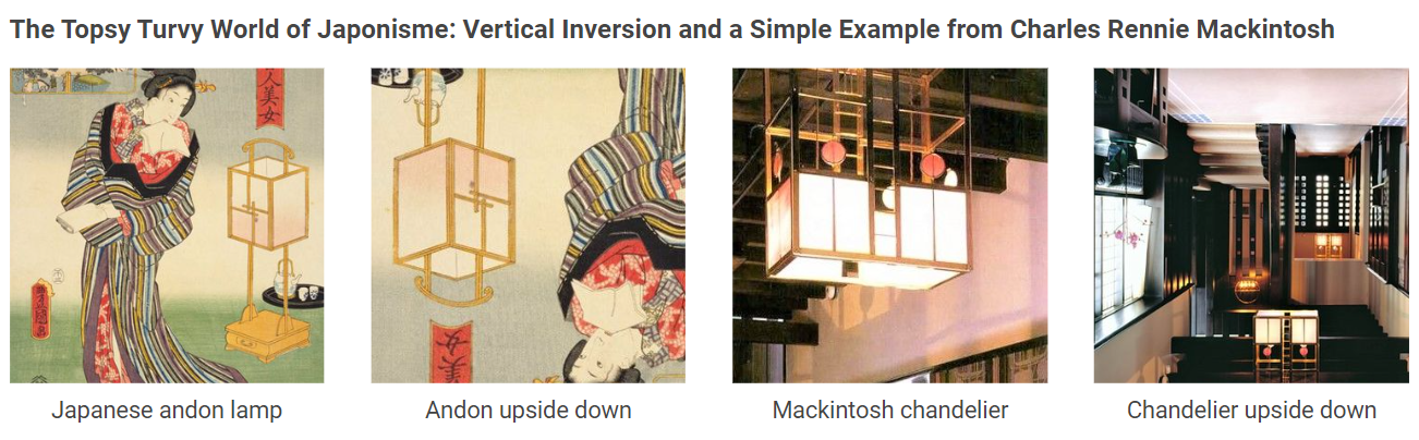
Mackintosh has placed two andon-like fixtures side by side, and then vertical inverted the pair, i.e., flipped them upside down, and turned them into a western-type ceiling fixture. While obviously not the same in every detail, it is evident that Mackintosh's modern 'chandelier' and the traditional Japanese 'andon' share much in common----what we might call the same morphological ancestry. A change of name and orientation and environment creates something 'new'; yet there is an unmistakable Japanese feeling ( or 'Wa' ) that runs through it.
In fact, there are many aspects of Mackintosh's Hill House, as well as his other creations, that reveal an eclectic array of Japanese motifs. Those influences range from the kimono (e.g. his well-known 'kimono cabinet') and ikebana flower arrangement, to Buddhist temple design and ornament. Even his watercolor botanical sketches are reminiscent of sumi-ink painting, and are at times signed in a vertical, oriental fashion, with the words framed (boxed in) as in Japanese prints (e.g. his sketch 'Japonica').
Mackintosh's first major biographer, Thomas Howarth, pointed out early on in his 1952 award-winning book, Charles Rennie Mackintosh and the Modern Movement, the importance of Japan as an artistic influence on Mackintosh. Here we have chosen only a few examples that readily illustrate the technique of inversion/reversal.
Complex Vertical Inversion: Utagawa Kuniyoshi and Marvel Comics' X-Men
Naturally, these kinds of japonisme inversions are not limited to architectural designs, but are found in a wide range of artistic media, including modern graphics and comic illustration----though that influence is not always so obvious at first glance.
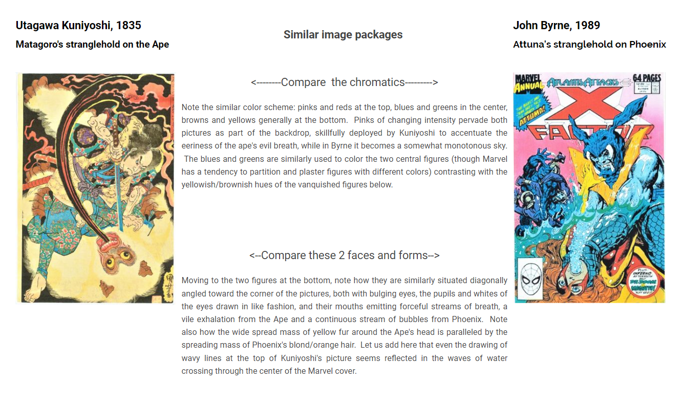
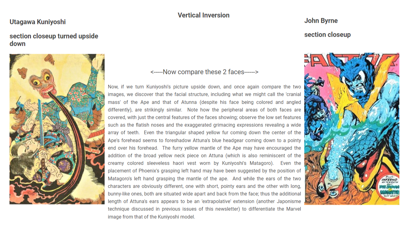
As an instance of more subtle and complex design inversion, let us compare the versatile 19th century ukiyo-e artist Utagawa Kuniyoshi (1798 - 1861) with one of Marvel Comics key artists, John Byrne (1950 - ). In particular, let us take a close look at Kuniyoshi's 1834-35 woodblock print 'Usui Matagoro kills a giant ape in the mountains of Hida' (Usui matagoro hida sanchu ni ozaru o utsu「碓井又五郎飛騨山中二打大猿」below left), and juxtapose it with the cover of Marvel Comics' X-Factor Annual Vol. 4, 1986 (published in 1989) by John Byrne (below right).
In Kuniyoshi's print, the hero Matagoro, a sort of Japanese version of Hercules, wrestles with and kills a ferocious giant ape, pinning it down with one hand and plunging a sword into its neck, so that the giant ape lets out a jet of vile and evil breath. In the Marvel cover by John Byrne, Attuna, the leader of the 'Atlantean' troops, forces the X-Men heroine Phoenix (Jean Grey) under the water while strangling her, so that she lets out a forceful stream of bubbly breath.
The general similarities of composition are obvious between Matagoro/Ape and Attuna/Phoenix, so that we may call them analogous 'image packages'; but there are further surprising parallels of detail, which only become apparent after 'flipping' one of the two images upside down, and then comparing them. We will first look at the images 'as is', and then vertically invert them to see what more there is to discover.
Interestingly, close observation reveals Kuniyoshi's ape has been used for both characters in the Marvel cover, that is Attuna and Phoenix, despite these two being quite different from each other at first glance. That is because they incorporate different aspects of the ape into their images, as well as new features not found in the ape; but nevertheless retain a recognizable likeness (what the philosopher Wittgenstein called 'family resemblances') to the beast for he is literally the 'missing link' between them.
***********
From the print version of
January 2021
Exhibiting Japonisme
Yasutaka Aoyama
The exhibits at The Japonisme Museum (Shogoin Sannocho, Kyoto) are essentially comparative and relative in nature, meaning the focus of each exhibit is a conceptual relationship, not the artworks displayed. It is the relationship that is being exhibited, of which the exhibited artworks are actors on what we might call that particular ‘exhibition stage’, where the various elements within the exhibit space are instruments of conveying the narrative. Each exhibit thus differs in display format from the rest, since each relationship can vary enormously in terms of style of artwork, type of influence, and historical epoch in which the relationship existed. Thus, each exhibit is a designed production, at times containing valuable artworks, but occasionally composed of copies only, where the value of the exhibit lies in how well the concept is expressed and in its educational impact, rather than just in the displayed items themselves.
The key criteria for constructing the exhibits may be summarized as follows:
1) Exhibit the most closely comparable and analogical precedents. Often in japonisme studies, examples of Japanese artwork offered as illustrative examples are only vaguely similar to the supposedly influenced artwork, even if much more apropos examples of Japanese art exist that would more clearly demonstrate the causal connection. The true degree of proximity, and thus influence, is the heart of the issue, for only then do we understand the process of artistic creation, and what is actually original and new. This should be a priority in deciding which artworks to exhibit.
2) Make explicit the conceptual relationship between the artworks. Once the most comparable examples are found, parallels between them must be made explicit. That is to say, the nature of the similarity, such as subject matter, form, composition, color, and the like, should be made readily apparent by the exhibit. That means object arrangement must take this into account, and caption cards require more than just name/date/place and other mundane information, but also proactive identification of the key concepts and similarities of detail. Additional creative methods employed, by which the relationship can be intuitively conceptualized transcend mere display technique, to become a new kind of aesthetic realization—a change in artistic interpretation and value.
3) Design a close to original, natural setting. The exhibited items should be placed in an environment close to that in which they originally existed, in terms of material, color, spatial scale, and other architectural elements. Ukiyo-e prints for instance, were neither intended for, nor viewed originally, in stark white display cases with fluorescent lighting. Even western oil paintings, while perhaps first exhibited on white exhibition walls, were expected to later grace the homes of a mansion or museum—which until the mid-20th century were rarely the chrome, glass, and blank white walls typical of museum architecture today. At The Japonisme Museum, the definition of exhibition space, such as rectangular, triangular, or other geometric configuration, or backdrop material, such as tatami flooring (including the choice of the tatami edge, ‘heri’), as well as other architectural features, have been customized for the specific items displayed, enhancing the impact of the exhibit. As an example of the above ideas, a window display of the Museum is discussed in the following pages. The exhibit is in a small triangular shaped space, visible from a side street on the west side of the building. While the window is only 86 cm high and 76 cm wide, the triangular shape of the limited space within allows the two small exhibition wall surfaces to be fully visible and easily viewed, allowing for better integration of verbal and visual information.
Sections from this issue transferred to 'Japonisme Insights into Modern Painting'.
***********
コミックスにおける歌川派の浮世絵に見られる換喩・拡張のジャポニスム
Metonymy and Magnification, Parts I & II
June 2020
From the print version, as all the issues below
The Japonisme of Metonymy and Magnification, Part I
Utagawa Kunisada and Marvel’s X-Men
The Ukiyo-e ‘Giant Face’ and its Impact on Comic Cover Designs
Yasutaka Aoyama
In past issues we have looked at a wide range of Japanese artists, both modern and traditional, and examined persistent parallels with American comic images. Those similarities are so extensive that we might call them whole ‘constellations’ of corresponding graphic details between the two worlds. Even so, we have yet to mention perhaps the single biggest ukiyo-e influence in the making of American action comics: the Utagawa school of artists, disciples of Utagawa Toyokuni (1769-1825). In particular, three masters of late ukiyo-e art---Utagawa Kunisada (1786 -1864), Utagawa Kuniyoshi (1798-1861), and Tsukioka Yoshitoshi (1839-1892)----developed the modern graphic techniques and imagery that came to be closely paralleled in comics of the 20th century. That modernity of technique increased over time in Kunisada and Kuniyoshi’s work, and went even further in Yoshitoshi. That being said, these three extremely prolific artists made equally significant contributions to comic imagery, though the nature of their contributions vary in artistic aspect.
We take up Utagawa Kunisada first, for the purpose of analyzing a key graphic technique in comics and commercial design as well: what we will call here imagistic metonymy. Metonymy refers to the linguistic phenomenon of how something comes to be called not by its usual identifying name, but by a thing or action associated with it, describing only a limited aspect or characteristic of the entity in question. For example, the word ‘dish’ can stand for an item on a restaurant menu, or ‘the crown’ can indicate not only a diadem or he who wears one, but the entire monarchical apparatus of state. Or take the phrase ‘lending a hand’, which is metonymic for the general act of assisting. We propose here that this term may also be applied to images; and our example is the giant detached face as an artistic backdrop in cover designs, used to forcefully convey the psychological presence of a particular person, or idea that person represents.
To be more precise, perhaps we should call the giant face backdrop an imagistic synecdoche. Synecdoche is limited to cases where either 1) a part represents the whole, such as ‘wheels’ to mean the whole car, or ‘suits’ to refer to businessmen; (acronyms function much in the same way); or otherwise 2) when the whole refers to a part, such as when ‘society’ is used to refer to high society in particular. The face is often a synecdoche for the person. However, there are often elements of both metonymy and synecdoche present at the same time, such is the case of the giant face motif under discussion. The face stands for the entire person, but also represents a certain emotion or intent, which is symbolized by that individual. If the particular individual is mainly a vehicle to convey that intention, such as ‘Evil’ to the viewer, then this is also metonymy, and therefore we have both part/whole relations and associative connections. Thus here we will treat synecdoche as a particular form of metonymy.
This imagistic metonymy or synecdoche is combined with magnification, i.e., enlargement of the metonymic element—here the face or head—for of course magnifying the expressive details of the facial features works to accentuate the persona or particular emotion to be conveyed. Ishinomori’s covers for Mutant Sabu are part of this tradition, which we looked at in the previous issue of this newsletter (2020.3.30), and in the case of the Marvel cover that was then discussed, it was the villainous intent of the character that was amplified by his smirking face looming in the background.
This sort of magnified synecdoche was not limited to faces/heads. The idea of magnifying, or ‘zooming in’ from a particular angle, and thus profiling a particular object, whether an inanimate object as a lantern, or something like a human foot or a horse’s leg, almost as if with a camera—yet before the invention of photography—was an artistic technique pioneered by Japanese ukiyo-e artists, and carried on into the Meiji period. In Kobayashi Kiyochika’s (1847-1915) ‘Pressure from a Heavy Hand’ of 1904, for instance, the enlarged, knobby ogre hand of older ukiyo-e prints is transformed into a slick sleeved, white cuffed (but still knobby and ogre-like) hand of a modern army officer. Magnifying the hand alone better conveys pure physical power and its oppressiveness, as opposed to magnifying the face which draws our attention more to the psychological motive of the one who wields that power.
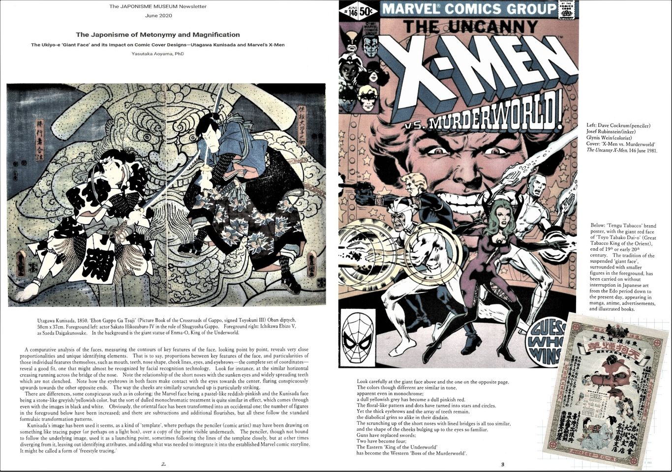
The giant face motif however, whether human, animal, or supernatural, is the more classic and frequent ukiyo-e metonym/synecdoche. We look at one such image by Kunisada, his ‘Picture Book of the Crossroads of Gappo’ (Ehon Gappo Ga Tsuji), 1850, depicting a fighting scene at Myokakuji Temple, in front of a giant statue of Enma-O, king of the underworld/hell. It takes from a scene in a Kabuki play, based on a true story from the 17th century of an ‘adauchi’ or righteous and honorable revenge, though much adapted for the stage. We compare this image of Kunisada’s with a Marvel Comics cover, ‘X-Men vs. Murderworld’ (The Uncanny X-Men, 146 June 1981) penciled (drawn) by Dave Cockrum, with Josef Rubenstein as inker. Is not the image of the ‘King of the Underworld’ unmistakably recognizable in Arcade, ‘Boss of the Murderworld’?
************
September 2020
The Japonisme of Metonymy and Magnification, Part II
Utagawa Kuniyoshi and Marvel’s X-Men
with Reflections on 'Languages of Art'
Yasutaka Aoyama
Utagawa Kuniyoshi (1798-1861) is probably the most well known of the Utagawa school of ukiyo-e artists, and one of the most popular to this day, both in Japan and among western connoisseurs of late ukiyo-e art. The influence of his lively and forceful style is not limited to the Marvel X-Men comic series, and more in that regard will be discussed in future issues of this newsletter. Here we take up a few instances of his use of what we defined earlier as 'imagistic metonymy and magnification', continuing our investigation of the giant face motif.
We will once again make comparisons with Marvel’s X-Men, to drive home the following point: that an overwhelming number of parallels may exist between certain Japanese artists and an American comic series during a specified period of time (here the early 1980’s), indicating a pervasive influence, despite the creators of that comic series making no admission of such artistic connections.
As our examples we look at two Kuniyoshi prints, each juxtaposed with a Marvel cover:
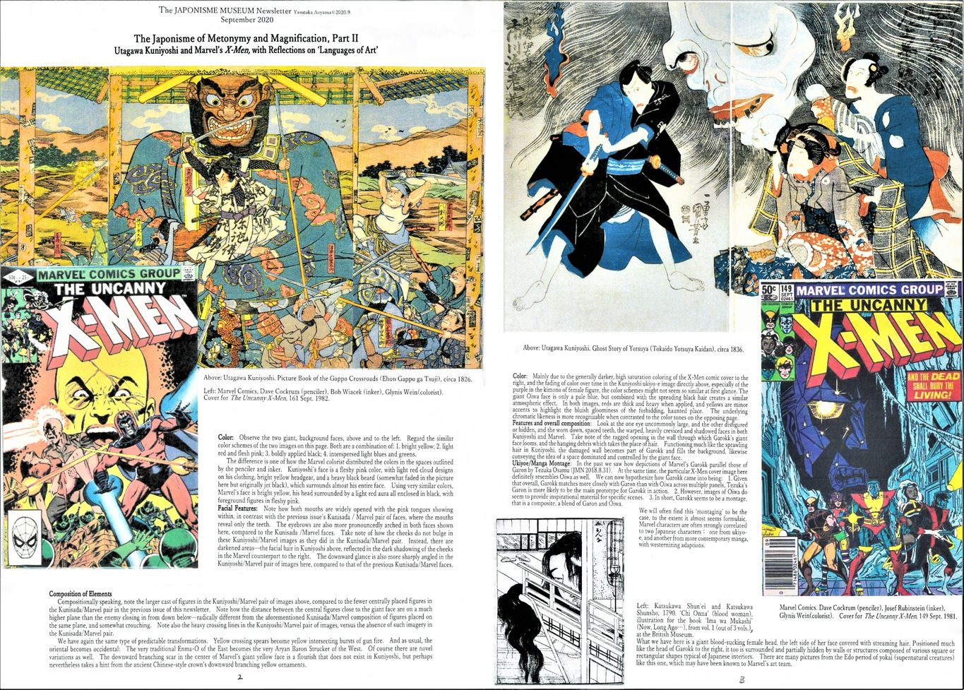
1st pair of images: a) ‘Picture Book of the Gappo Crossroads’ (a 1826 triptych version of the same story of vengeance we saw in Kunisada in the previous issue), a face of ‘Enma-O’, king of the underworld (hell), juxtaposed with b) the face of Marvel’s ‘Baron Strucker’ on the cover of The Uncanny X-Men 161 Sept., 1982.
2nd pair of images: a) ‘Ghost Story of Yotsuya’ (1836 diptych) the grotesque visage of ‘Oiwa-san’ juxtaposed with that of b) the monster ‘Garokk’, from the X-Men cover for issue 149 Sept., 1981.
What is interesting to discover is that we can once again neatly match up particular faces by Kuniyoshi with those by Marvel, just as we did with Kunisada (JMN 2020.6.30).
The similarities are more than just general parallels of composition or construction. The facial images of Marvel correspond closely enough in significant detail with their counterpart model ukiyo-e images as to be clearly identifiable as such, much in the way that caricatures by different artists of a particular politician can still be recognized as modeled on the same individual, in contrast to caricatures of other politicians. This is especially apparent when Kuniyoshi’s Enma-O and Marvel’s Baron Strucker are examined vis-à-vis Kunisada’s Enma-O with Marvel’s Arcade (in the previous issue)—that is, when all 4 images are viewed together.
The second image of Kuniyoshi is just one of many ukiyo-e, manga, cinema, and countless television depictions of the hideously disfigured Oiwa-san, a character in perhaps the best known horror story of Japan----Ghost Story of Yotsuya. A kabuki play written by Tsuruya Nanboku IV (1755-1829) in 1825, it became an instant classic. Kuniyoshi’s giant suspended Oiwa face with her rotting, gapping teeth, set in a blue-purple-black chromatic scheme, hints that, among many such Oiwa ukiyo-e portraits, Kuniyoshi’s version may have been known to Marvel artists.
Kuniyoshi’s image of Oiwa is somewhat unique however, with her widely flaring hair. In traditional Japanese depictions, Oiwa is portrayed more like the Marvel image, with hair drooping over the left side of her face, hiding a disfigured eye, and placed in a haunted-house type setting. And in that sense, Marvel’s Garokk might be considered a more traditional Oiwa look-alike than Kuniyoshi! Naturally though, Marvel’s Oiwa has been adapted to fit the X-Men comic setting and storyline, by applying the usual ‘inversions’ such as race / gender switches; or imaginative ‘extrapolations’ (see JMN 2019.12.31) where form is kept but substance changed (e.g. instead of hair we have the tangled mess of ragged walls).
It must be emphasized that nowhere else except in Japan do we find such a plethora of precedents for modern comic imagery. Even if occasional similarities with comic art might be found in early art from other countries around the world, the very same sort of similarities usually can be found in ukiyo-e art, and most importantly, closer in form to that of modern comics. Thus inductively speaking, it is much more logical to first posit a link between premodern Japanese art and American comic traditions before seeking other explanations, if we are to base our conclusions upon the weight of circumstantial evidence.
The various close correspondences in subject matter and motif between Japanese art and American comics are much like the similarities between two Indo-European languages in vocabulary and linguistic morphology, and the close parallels of metonymic technique discussed above are like similarities of syntax and idiomatic constructions of grammar between two related languages. They have their differences, but these vary in a characteristic manner. We should not ignore such ties between one ‘language of art’ and another, no less than the historical link between, let us say English and German, just because there remains no historical testimony attesting directly to that fact; or because it might be vehemently denied by those who would rather appear completely original. To claim that the similarities between ‘Guten Morgen’ and ‘Good Morning are only an interesting, passing coincidence, is an assertion that can only be maintained by looking at such a phrase in isolation----in ignorance of the vast body of fundamental and systematic parallels that exist between the two languages, of which only a few examples can be discussed on any one page.
**********
マーベルコミックが取り入れた石ノ森章太郎の図像
A 3 Part Series on Ishinomori Shotaro's Manga Imagery in Marvel Comics
October 2019
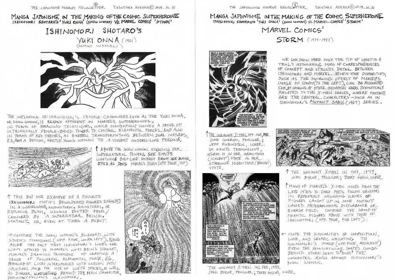
Manga Japonisme in the Making of the Cosmic Superheroine
Ishinomori Shotaro’s ‘Yuki Onna’ vs. Marvel Comics’ ‘Storm’
Yasutaka Aoyama
The manga of Ishinomori Shotaro (1938 - 1998) offers us strikingly vivid precedents, in terms of artistic technique and character models, for female superheroes in the Marvel Comics series The Uncanny X-Men. One of the most highly regarded and best-selling manga artists in Japan, Ishinomori’s works include the phenomenally popular Kamen Rider and Cyborg 009 series, both adapted for television and film. Multiple parallels to Ishinomori’s drawing techniques, characters, and story themes, dating back to the early 1960’s, before X-Men, can be readily identified in the work of Marvel writer Chris Claremont (1950- ) and artists such as David Cockrum (1943 - 2006), John Byrne (1950 - ), and Terry Austin (1952 - ), especially during the late 1970’s and early 1980’s.
Depictions of female mutant powers in Marvel comics, including: their catalytic reactions with natural forces; transformations of shape and identity; qualities of female movement and suspension, including a variety of ‘transcendental’ states of being—all these indicate a significant debt to Ishinomori Shotaro’s rich, trademark style of expressing the idea of female empowerment and mastery over the forces of nature—which gave him renown as a manga innovator.
Likewise with the story themes Ishinomori assiduously cultivated. He provides the combination of narrative and concepts, as found in his Yuki Onna (1961) about a changeling snow woman and Ryujin Numa (1961) about a dragon who takes the form of a woman, that come to animate X-Men stories. Three themes stand out: 1) the central female character is a sort of cosmic energy ‘transducer’ or catalyst, at times masterfully controlling the elements, but at other times possessed by those forces; thus 2) an extreme case of split personality—a caring, loving, calm young woman vs. a wild and dangerous goddess with the irrational side of the female persona magnified; who 3) unexpectedly attacks and shocks her friends after a sudden ‘henshin’—a supernatural, instantaneous, and marked transformation of her psychological and physical being, at times into some sort of avian or serpentine creature.
Furthermore, Ishinomori’s association with ‘shojo manga’ (comics for schoolgirls, a particularly well-developed genre of comics in Japan), also explains why his female characterizations were numerous and displayed an impressive diversity in illustration technique. He was thus a trailblazer in creating stories of mutant romance, mutant female rivalry, and mutant big brother/little sister adventures, as found in X-Men episodes in the years to come. We have already discussed the influence of Tezuka Osamu (JMN 2018.8.31, JMN 2018.10.31); and we find in the very same comic-books, but in other panels, the impact of Ishinomori as well. As was the case of ukiyo-e art, the use of modern manga was also extensive and eclectic. Thus ukiyo-e and manga influences existed side by side, both being ‘recipe ingredients’ critical to the making of various American comic-books.
Finally, to gain the proper perspective, it is important to note just as we found in the case of Tezuka Osamu, that Ishinomori himself carries on, though reworked in modern form, themes and images which have existed for centuries in Japanese religion/folklore and their associated arts. Indeed, the roots of Ishinomori’s key themes as well as those of the Marvel characters ‘Storm and ‘Phoenix’ might be traced back to conceptions of the benign ‘Nigi-mitama’ versus the violent ‘Ara-mitama’ dual persona of Shinto gods. Certainly stories of female deities and yokai (multifarious monsters and spirits) who possess some sort of meteorological or cosmic power are well-established artistic themes in Japan. Besides tales of snow women, there are also rain women; others include Hashihime (a water dwelling vengeful ghost of a woman who can whip up a storm), dragon princesses as Ryunyo (in the Lotus Sutra), feminized bodhisattvas such as Kannon, and of course Amaterasu, the sun goddess and principal Shinto deity. This is but to name a few that are part of a cultural milieu (differing from the West), where the elemental and cosmic forces are often characterized as female, products of a highly polytheistic and female-attuned artistic imagination.
*************
December 2019
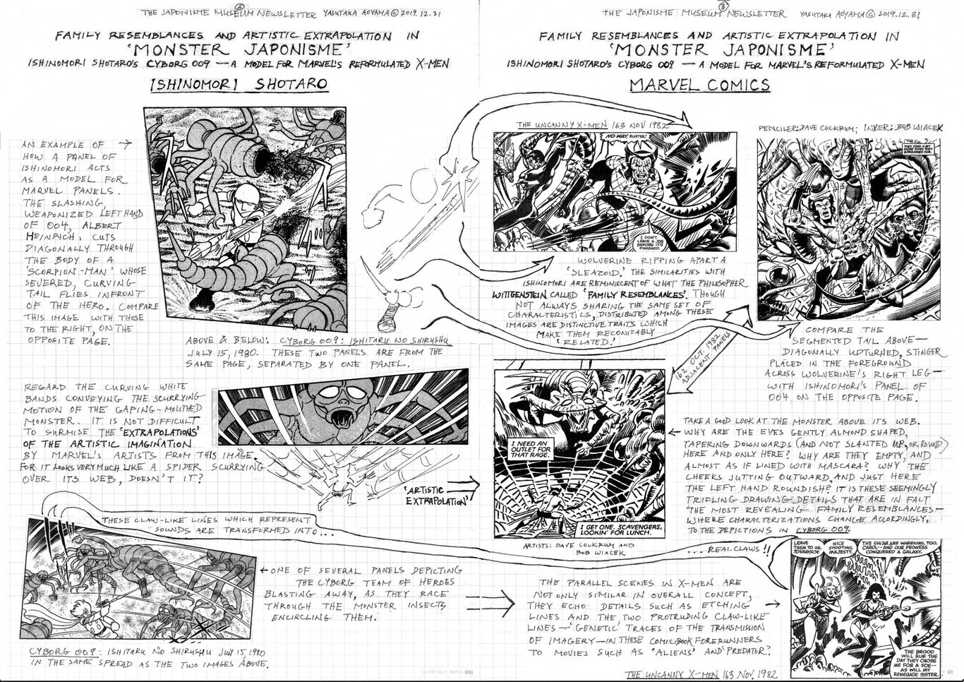
Family Resemblances and Artistic Extrapolation in
‘Monster Japonisme’
Ishinomori Shotaro’s Cyborg 009――A Model for Marvel’s Reformulated X-Men
Yasutaka Aoyama
In the previous issue (2019.10.31) we examined parallels between manga artist Ishinomori Shotaro (1938-1998)’s female characterizations with those in the Marvel Comics’ The Uncanny X-Men. Here we ask: Was Ishinomori’s popular comic-book series Cyborg 009 the model for Marvel’s reformulated X-Men of the mid-1970’s onward? Were X-Men images at times ‘extrapolated,’ if you will, from images in Cyborg 009? That is to say, were they extensions and elaborations of those drawings? If so, it would do much to explain the radical changes in X-Men introduced by writer Chris Claremont (1950- ) and collaborating artists such as Dave Cockrum (1943-2006) and Bob Wiacek (1953- ) in the 1970's.
To begin with, Ishinomori’s concept of a large international team of comic superheroes was quite revolutionary for its time, not to mention the novel-like complexity of narrative, weaving together so many characters, in comic-book form. To have a Russian---this in the midst of the cold war---alongside an American as members of the same heroic team, took more courage than we might imagine today. And to place them together with a Japanese and a German, when WWII was a living memory for many, was also daring. Furthermore, the idea of portraying the future of society as one where cybernetically altered or genetically mutated individuals were increasing in number, endowed with new morphological and extrasensory capabilities, and where those beings would become the targets of racist-type discrimination, was explored in full for the first time in comics by Ishinomori. Variations on these themes would be replayed in X-Men and in countless SF productions, from Star Trek to Planet of the Apes.
Ishinomori’s influence was not limited to basic themes. Cyborg 009 seems to have been a sourcebook for X-Men member prototypes. Though characters were never simply duplicated, they often shared what the philosopher Wittgenstein called ‘family resemblances’. For instance, Ishinomori’s agent 001 is a Russian babe ‘Ivan’ whose cosmic, telepathic, and time transcending psychic powers are to be found in Marvel’s Phoenix, the American beauty Jean Grey. But X-Men’s Russian, Piotr Rasputin known as Colossus, is more analogous to Ishinomori’s 005 Geronimo Junior, a Native American of likewise colossal strength.
Or take the once delinquent teenager 002 Jet Link, an American with pointy, bird-like features, moving at lightening speeds, just as the pointy and devilish-looking X-Men character Night Crawler, who is however, a German named Kurt Wagner. By contrast, Ishinomori’s German, 004 Albert Heinrich, has fingers that cut like blades, much like the metal claws of Wolverine, the American Logan who claims Japan as his second home.
And while the Chinese 006, Chanchanko, spits fire from his mouth, X-Men’s Cyclops, the American Scott Summers, shoots fire from his eyes. The shapeshifting 007, whose name and birthplace is ‘Great Britain,’ can assume the form of any individual, just like X-Men’s ‘Changeling’ and later ‘Morph,’ as well as the florescent blue, British Raven Darkhölme, known as Mystique. ---And so forth, traits and identities mixed and matched. Even the X-Jet reminds us of the cyborg team’s aircraft ‘Dolphin,’ equipped with a helicopter, just as the X-Jet would be in a later animated series.
That such a team of young superheroes would be brought together by an older and wiser professorial figure, acting as their coach and advisor, also parallels Ishinomori. X-Men’s Professor Charles Xavier follows the lead of Cyborg 009’s Professor Isaac Gilmore; though interestingly, while Ishinomori’s image of a man of erudition is clearly derived from the West, Marvel’s seems to possess something of the East. Indeed, the X-Men leader on his wheelchair is at times depicted with features that are strangely oriental, looking somewhat like old portraits of Zen monks in their priestly chairs. Might we add here that the storyline is similar in some respects to Kyokutei Bakin’s early 19th century illustrated novel, the Hakkenden—a fantasy epic about eight youths brought together into a band of heroes by a bald monk.
As tangible evidence of a link between Cyborg 009 and X-Men, we look at what we will call here ‘Monster Bug Battle’ scenes. We compare those from Cyborg 009: Ishitaru no Shirushu (the dragon of Ishtar), episode of July 1980, with similar scenes in The Uncanny X-Men, issues 162 Oct. and 163 Nov., 1982, part of the same story arc. We find that sets of panel images from a page or spread in Cyborg 009 can be found with the same identifying details among panels within one page or spread in the corresponding X-Men issues as well.
Surely if concrete influence cannot be claimed here, probably no claim of artistic copyright would hold in a court of law; nor would the widely accepted principles of historical dating and determining influences in art and archeology be henceforth considered valid. For all rest upon the idea that while coincidence exists in human endeavors, 1) clusters of distinctive content, composition, and stylistic detail do not simply replicate themselves by accident, and that 2) congruent circumstantial evidence is more reliable than motivated witness testimony.
A final comment for historical perspective. The most well-known case of ‘Monster Japonisme’ (the global influence of Japanese monster images) is of course that of Godzilla, but the monster bug battle motif has more ancient origins. Its roots lie in the legend of Minamoto Raiko and his team of warriors’ battling a giant spider, the ‘tsuchigumo,’ as seen in the Tsuchigumo Zoushi, an emaki (picture scroll) of the 14th century. The giant insect theme appears in other Japanese medieval emaki as well, such as the Kobo Daishi Gyojo Ekotoba (which recounts the life of the priest Kukai), where a swarm of giant hornets attack people at Todaiji Temple in Nara. While Europe has its fair share of dragons and Minotaur or Grendel-like ‘beastly’ creatures, the monster bug battle is relatively new to the West; and here, once again, Japanese art has stimulated the growth of the modern artistic imagination.
***********
March 2020
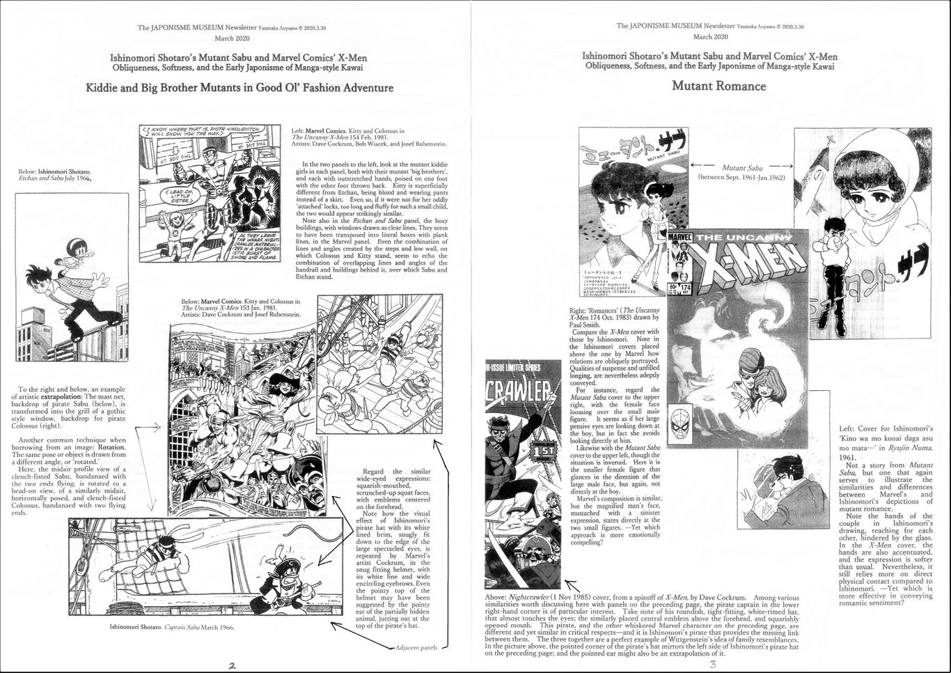
Ishinomori Shotaro's Mutant Sabu and Marvel Comics's X-Men
Obliqueness, Softness, and the Early Japonisme of Manga-style 'Kawai'
Yasutaka Aoyama
Ishinomori Shotaro (1938-1998)'s versatile manga characters likely served as prototypes for male and female American comic-book superheroes---as detailed in past issues of this newsletter. In the previous issue (JMN 2019 Dec), we discussed 'Monster Japonisme,' and the infuence of Ishinomori's 'monster bug battle' scenes, which naturally emphasize rather menacing characterizations. Now we look at he other end of the spectrum; Ishinomori's contribution the softening of characterizations. We find in Marvel comics from the latter 1970's, bad guys and good guys becoming more emotionally subtle in manga style, and that a blurring occurs of hard contrasts between good vs. evil. But that is not all: there is also an improvement in the suppleness of poses in American comics; and the adding of what wee might call more dreamy or misty imagery with organic and abstract design flourishes, a la Ishinomori. In early X-Men issues, bodily poses were rather stilted and standardized, despite attempts to creat variety by obvious differences in the appearance of characters (e.g. muscular vs thin). Panel backgrounds were often simple interior or exterior settings, repetitive and flat. This was where Ishinomori's work, based on long experience catering to aesthetically sensitve sentimental young female readers, in the hightly developed genre of 'shojo manga' (comics for girls), seems to have provided fresh inspiration for Marvel's artists, in refining their drawing techniques.
In 'Kitty's Fairy Tale' (The Uncanny X-Men 153 Jan. 1981), an Arabian Nights type of storytelling within a story (complete with a genie from a bottle), allows Marvel to weave in Ishinomori-style softness and 'kawai' (aesthetically appealing cuteness) themes into the more hardcore action type storyline of X-Men. The 'big brother mutant and kid sister mutant in good ol' fashion adventure' follows in the footsteps of Ishinomori's Sabu and Etchan (July, 1966) .
'Romances' (The Uncanny X-Men 174 Oct. 1983) is also part of this turn towards a softer and gentler X-Men. We will pass over the obvious japonaiserie of Woverine's quest (in a Japan full of feudal castles) for Mariko' hand in marriage, and his confrontation with the 'Silver Samurai'----needless to say Marvel's artistic team had Japan in their minds when creating this issue. More important is the reflection of Ishinomori's shojo manga approach in X-Men narratives of mutant romance, as between Cyclops and Madelyne Pryor. We compare one such cover image from Marvel with similar images from Mutant Sabu (issues published between Sept 1961--Jan 1962), along with Ishinomori's title page for 'Kino wa mo konai, daga asu mo mata...' (Yesterday will never return, but once again tomorrow...), a story included in the manga book Ryujin Numa (1961), whose influence upon X-Men has already been discussed (JMN 2019 Oct).
Generally speaking, romance in X-Men type action comics was expressed in obvious fashion by stereotypically drawn profiles of couples 'necking' , i.e., in an embracing kiss, a fleeting interlude between the violent battle of good vs. evil. The skill required to successfully convey obliqueness in relationships and emotions by the drawn line, such as unrequitted love, sibling-like affection, or unspoken understandings, was still not up to par with Japanese manga, though manga techniques were gradually being assimilated. While Marvel characters were portrayed as caring for each other, their interactions tended to be physically and verbally explicit, or explained away by added commentary, and one of the reasons why characters are so garrulous in American action comics is perhaps due to this larger dependence on dialogue to carry a story.
Thus, along with Ishinomori's Cyborg 009, which seems to have acted as a basic blueprint for the reformulated X-Men of the mid-1970's onward (as discussed in the previous issue), Mutant Sabu provided additional imagery and ideas, including extensive expostulation on the Darwinian evolutionary logic of how mutants came into being, helping to flesh out and complete the X-Men storyline. And as we saw in the monster bug combat scenes in Cyborg 009, here too in Mutant Sabu, despite the contrasting subject matter, can be found: 1) the philosopher Wittgenstein's 'family resemblances' between Ishinomori and Marvel characters, as well as 2) 'artistic extrapolations' of Ishinomori's work by Marvel---transforming extensions of Ishinomori images. We should add that the processes at work above are not necessarily confined to the case under discussion here, nor even to comic art in general. That is to say, the study of Japonisme holds a wider significance for art history and theory, providing valuable insights into the psychological process of artistic innovation---how one set of artistic forms acts to 'suggest' the creation of new images in the artist's mind.
Finally, we must not forget that The Uncanny X-Men was an amalgam of Japanese artistic sources, not limited to Ishinomori, despite his critical role in shaping X-Men as we know it today. We have already proposed that those to whom Marvel was indebted to ranged from 20th century manga artists, as Tezuka Osamu (JMN 2018 Aug, Oct), to much earlier ukiyo-e masters as Hokusai (JMN 2018 Oct, Dec; 2019 Feb), Torii Kiyomasu (JMN 2019 April, June) , and Suzuki Harunobu (JMN 2019 Aug), as well as others to be discussed in future issues of this newsletter. For while we will often hear, loudly proclaimed the reverse to be true, it was Japan---in all its imaginative forms---that was for Marvel Comics their artistic touchstone, a storehouse of images and font of ideas from which their artists eagerly drank from, and repeatedly tapped into, whenever they went in search of solutions.
***********
August 2019
Ukiyo-e Imagery in the Making of the Comic-Book Superheroine
Suzuki Harunobu’s Billowing and Bounding Beauties
& Depictions of Female Power in Marvel Comics
Yasutaka Aoyama
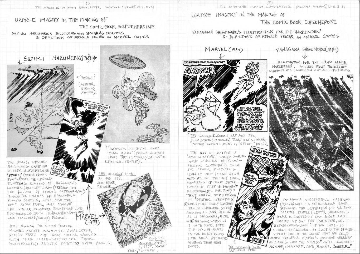
The originator of full color ukiyo-e prints or ‘nishiki-e’ was Suzuki Harunobu (1724-1770), and elements of modern comic-book superheroines can be traced back to his woodblock prints from the mid-18th century. We saw in earlier issues of this newsletter how Torii Kiyomasu I (1694-1716) was an example of ukiyo-e influence from the early 18th century (JMN 2019.4.30), and Katsushika Hokusai (1760-1849) exemplary of the role played by late 18th/early 19th century Japanese illustrations (JMN 2018.10.31--2019.2.28) in shaping modern comics. Harunobu’s artistic activity fits neatly in-between that of Kiyomasu and Hokusai, and attests to just how widely and thoroughly American cartoonists searched ukiyo-e art, not only for models of male, but also female images of action and power.
While the stereotypical ukiyo-e print is one of lithe though somewhat placid if not static poses, as in Utamaro’s bijinga (pictures of beautiful women) or Sharaku’s actor portraits, the truth is that ukiyo-e abounds with innovative depictions of fast movement and action, both of men and women. And it is this trait of originality in the drawing of movement that ties Kiyomasu, Harunobu, and Hokusai together, despite their contrasting artistic styles.
Traditional Western art has many depictions of gowned angels and the like, floating and suspended in mid-air, but the manner of drawing is influenced by the Greco-Roman style: distinct and shaded multiple folds, characterized by the complex intersection of numerous and often straight lines meeting in diverse angles. Differences exist mostly as a matter of degree. For a true model of women leaping about in heavy, billowing garments, undulating with un-creased folds, we must look to Japanese precedents in ukiyo-e art, for which Harunobu provides excellent examples. And while Ishikawa Toyonobu (1711-1785) and Torii Kiyotsune (active mid-18th century) produced somewhat similar drawings, it is Harunobu’s that are the best known in the West, and the most likely source of inspiration for that sort of imagery.
The depictions of the X-Men female character ‘Storm’ (Ororo) by Marvel artists such as John Byrne (1950- ) or George Perez (1954- ) as pencilers and Terry Austin (1952- ) as inker (The Uncanny X-Men 124 Aug. 1979; 127 Nov. 1979; King Size Annual X-Men 3, 1979) reflect details characteristic of Harunobu’s nishiki-e, in particular his ‘Summer Evening Shower’ print of 1765, and his ‘Beauty Jumping from the Balcony of Kiyomizu Temple’, published in the same year.
Yanagawa Shigenobu (1787-1832), son-in-law of Hokusai and carrying on the Hokusai tradition, is also included here as an example of the eclectic, amalgamative approach of Marvel cartoonists taking from various Japanese artists of differing epochs in developing and fleshing out a particular character’s image. The illustration introduced here is a scene from Kyotei Bakin’s novel Nanso Satomi Hakkenden (1814), which translates into something like ‘The House of Satomi’s Eight Canine Warriors’, historically significant as the forerunner of now common graphic narratives centered around a team of journeying superheroes, linked by some precious power-endowed treasure, and combating a mighty enemy. We look at an image of ‘Phoenix’ (Jean Gray) and ‘Storm’ penciled by John Byrne for The Uncanny X-Men, 135 July (1980) as an example of superheroine imagery that harks back to the Hakkenden illustrations.
Thus American comic-book heroines are shaped by the confluence of diverse Japanese sources such as Harunobu and Shigenobu, but there is usually one predominant ukiyo-e print which acts as the primary model or ‘establishing shot’---to borrow a term from motion pictures---from which extensions on a theme are created. That is to say, comic-book panels are added on much in the way a variety of short shots from different angles are spliced into an establishing shot (a shot that acts as the key image-concept) in producing a film scene.
Postscript: If a world famous artist like Henri de Toulouse-Lautrec might be influenced by the same Harunobu imagery, why not comic book artists like Byrne and Perez? Take a look at the images below, Lautrec’s Loie Fuller (left) and Harunobu’s Beauty jumping from Kiyomizu Temple (right):
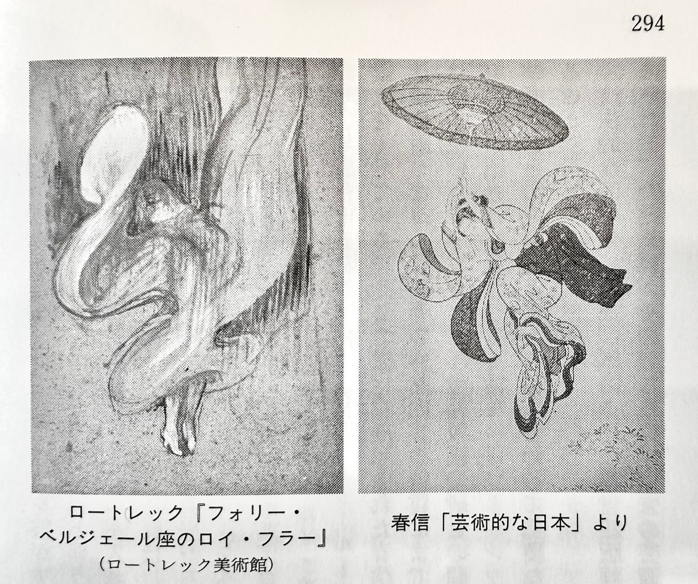
From Oshima Seiji’s ‘Japonisme’ (ジャポニスム 印象派と浮世絵の周辺), Kodansha, 1992
***********
Torii Kiyomasu, Parts I & II
April 2019
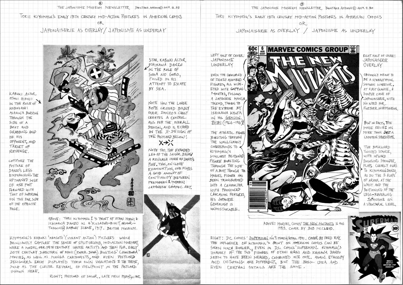
Torii Kiyomasu’s Early 18th Century Mid-Action Poses in American Comics
or
Japonaiserie as Overlay / Japonisme as Underlay
Yasutaka Aoyama
Torii Kiyomasu I (1694-1716)’s woodblock prints are highly prized by ukiyo-e collectors worldwide. The leading museums in America and Britain usually include him in their early 18th century Japanese print collections alongside his father (or possibly older brother) Torii Kiyonobu, and other leading artists of the Torii and Kaigetsudo schools. While little is verifiable about Kiyomasu (in this author’s opinion it is most probable that he was the son of Torii Kiyonobu, dying in his early 20’s, and for that reason we know so little of him), there is no question about his talent. Somewhat reminiscent of Sharaku in combining genius with mystery, his prints exude a dynamic, buoyant liveliness, expressing the burgeoning confidence of the city of Edo and its inhabitants.
Kiyomasu’s large print of a kabuki kusazuri-biki (‘armor-tugging’) scene between actors Ichikawa Danzo and Otani Hiroji, at the British Museum, has been often included in books on the history of ukiyo-e, and is one of the better known ukiyo-e prints in the English-speaking world. We should not be surprised then, if his dynamic, mid-action postures came to inspire comic-book artists even centuries later. Until now in this newsletter, we have primarily examined the influence of more recent Japanese artists such as Katsushika Hokusai and Tezuka Osamu. Stepping back a hundred years from the mature Hokusai, here we take a look at Kiyomasu’s print of 1717, comparing it to a Marvel Comics’ cover by Bob McCleod for the X-Men spinoff, The New Mutants (No. 6 Aug. 1983), a series created by Chris Claremont and Bob McCleod.
When the two images are juxtaposed, it becomes evident that the Marvel Comic cover relies on Kiyomasu’s print, though certain identifying traits such as ethnicity and costume have been changed in places. The influence therefore, is not always explicit but camouflaged, if you will, so that without knowledge of Kiyomasu we would most likely assume that the figure bursting through the wall on the left side of the Marvel cover had nothing to do with traditional Japanese art.
Of equal interest is the character on the right side of the Marvel cover, obviously a samurai warrior as a westerner might imagine him to be, manifestly Japanese---intended to be identified and discernable as such to almost anyone---the common trait of all that is called ‘japonaiserie’. But at the same time, Marvel’s samurai owes to the figure on the right side of Kiyomasu’s print, Ichikawa Danzo (probably in the role of Soga no Goro), regarding his stance/posture. So in fact there is a substrata of specific ukiyo-e influence in terms of conceptual schema and structural detail, that is undisclosed and not easily discerned, underlying an exterior of what appears to be merely a product of the cover artist’s own fanciful ideas of ancient Japan. In other words, we have both japonaiserie and japonisme in one image, one over the other. Typically, japonaiserie might be considered to fall under the wider umbrella of japonisme; or as an early phase of japonisme; or at times simply synonymous; but we separate the two here for the sake of clarifying distinct aspects of the Japanese presence in Western art.
What is so significant about Kiyomasu’s print was its success in capturing the sense of the millisecond, ‘midst-of-action’ moment. Where the norm for much of the world was portraying a crowning moment of history, such as the panorama of a victorious battle or the height of religious pathos, or otherwise a majestic or leisurely pose, Japanese artists, Kiyomasu and those after him, also strove to artfully convey the instant within a split-second action, such as a bullet in mid-flight. This facet of japonisme is not sufficiently recognized nor fully appreciated, but that influence in American comic art was widespread, even decades before the Marvel cover we have been discussing. Among any number of possible examples, a cover from DC Comics’ Superman (No. 9, 1941) has been included as an early variation of Kiyomasu’s ‘bursting-through-barrier’ theme.
***********
June 2019
The Evolution of Torii Kiyomasu’s Bursting-Through-Barrier Theme:
Breaking Through to Other Worlds
and the Japonisme of ‘Impact Splotches’ in Form and Color
Yasutaka Aoyama
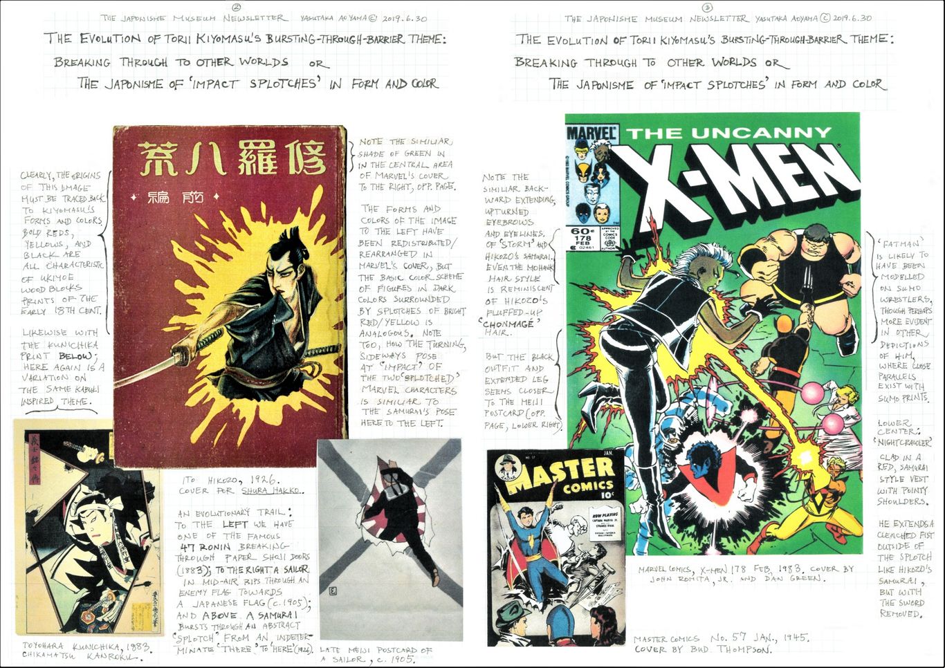
Torii Kiyomasu’s early 18th century ‘bursting-through-barrier’ imagery, taken from kabuki plays, was a method of capturing, as if in a snapshot, the mid-action instant of violence (discussed in the previous issue of this newsletter 2019 April). This barrier-breaking motif was often replayed in ukiyo-e prints later in the Edo period, and variations on the theme continued to be produced throughout the Meiji (1868-1911), Taisho (1912-1925), and Showa (1926-1989) periods. Starting with woodblock prints, the motif then appears in book illustrations, movies, manga, and even postcards.
If we scrutinize these various sources, we find an evolution taking place: from breaking through thick to ever lighter, and finally ‘evanescent’ barriers. More specifically speaking, from solid wood planks to paper shoji doors, and from there to more abstract depictions of paint-like ‘splotches’---which no longer represent a material barrier but an opening between different dimensions or worlds. That is to say, the broken barrier evolves from being a wall between two adjacent physical places, into a point of ‘crossover’ from one imaginary space to another, both indeterminate and undefined, except in its relation to the intended audience---i.e. us, the viewers of the image. We might even call it a visual representation of transversing ‘mental spaces,’ to borrow a term from cognitive linguistics.
To illustrate this changing conceptualization, the following images have been chosen: Ito Hikozo (1904-2004)’s cover for the best-seller Shura Hakko (1926, written by Yukitomo Rifu), Toyohara Kunichika (1835-1900)’s woodblock print of Chikamatsu Kanroku from his series on the 47 Ronin, the Gishi Meimei Den (1883); and a Japanese postcard of a sailor (c. 1905, artist unknown, introduced in the previous issue of this newsletter). The sailor in the postcard, who is literally suspended in mid-air, and Ito Hikozo’s samurai likewise floating in a space without objects, are both depictions of a temporal, relativistic division, unattached to any particular geographic place. The former stands in-between the [here and now] vs. the [there and after]; the latter in-between the [there and then] vs. the [here and now]. The splotch opening becomes a device to accentuate the ‘inter-dimensional instant’ between the two conceptions, as well as amplify the character’s dynamism.
And once again, we find these techniques percolating into American comics. Out of many possible examples we look at two comic-book covers: one by Marvel’s veteran artists John Romita, Jr. (1956- ) and Dan Green (active 1970’s onward) for The Uncanny X-Men 178 Feb. (1983); and the other by Bud Thompson (active 1930’s-1950’s) for Master Comics 57 Jan. (1945). Multiple parallels may be observed in terms of penciling, coloring, and overall concept; the splotches also have contributed to the manner of depicting the explosive impact of energy fields or forces emitted by the superhero or villain against one another in modern comics.
Until now, it was the japonisme of forms---lines and drawing technique, postures and expressions, composition and subject matter, that were implicitly the focus of this newsletter, not color. Here with this color issue, we can begin to make explicit the japonisme of colors: the influence of color choice, color combinations, and chromatic sensibility; and how that artistry of color enhances the intensity of the mid-action moment of crossover or collision.
***********
Hokusai in Modern Comics
Hokusai's Earth, Wind, and Fire, Parts I ~III
October 2018
Hokusai’s Earth, Wind & Fire in Marvel Comics’ X-Men, Part I
Direct vs. Indirect
Transmissions of Supernatural Force and Energy
Yasutaka Aoyama
When discussing the influence of traditional Japanese arts upon late 20th century American comic art, in most cases we need to consider two possible channels of influence: what we will call here:
(A) ‘Direct Transmission,’ or the influence of Edo(1603-1867) and Meiji(1868-1912) period ukiyo-e and manga prints, or even earlier Yamato-e (classical Japanese painting such as picture scrolls), observed in their original form by American comic artists, opposed to
(B) ‘Indirect Transmission’ or the influence of those same images but after having been modified by more contemporary Japanese mangaka (comic artists) whose work has then been observed and incorporated into American comics.
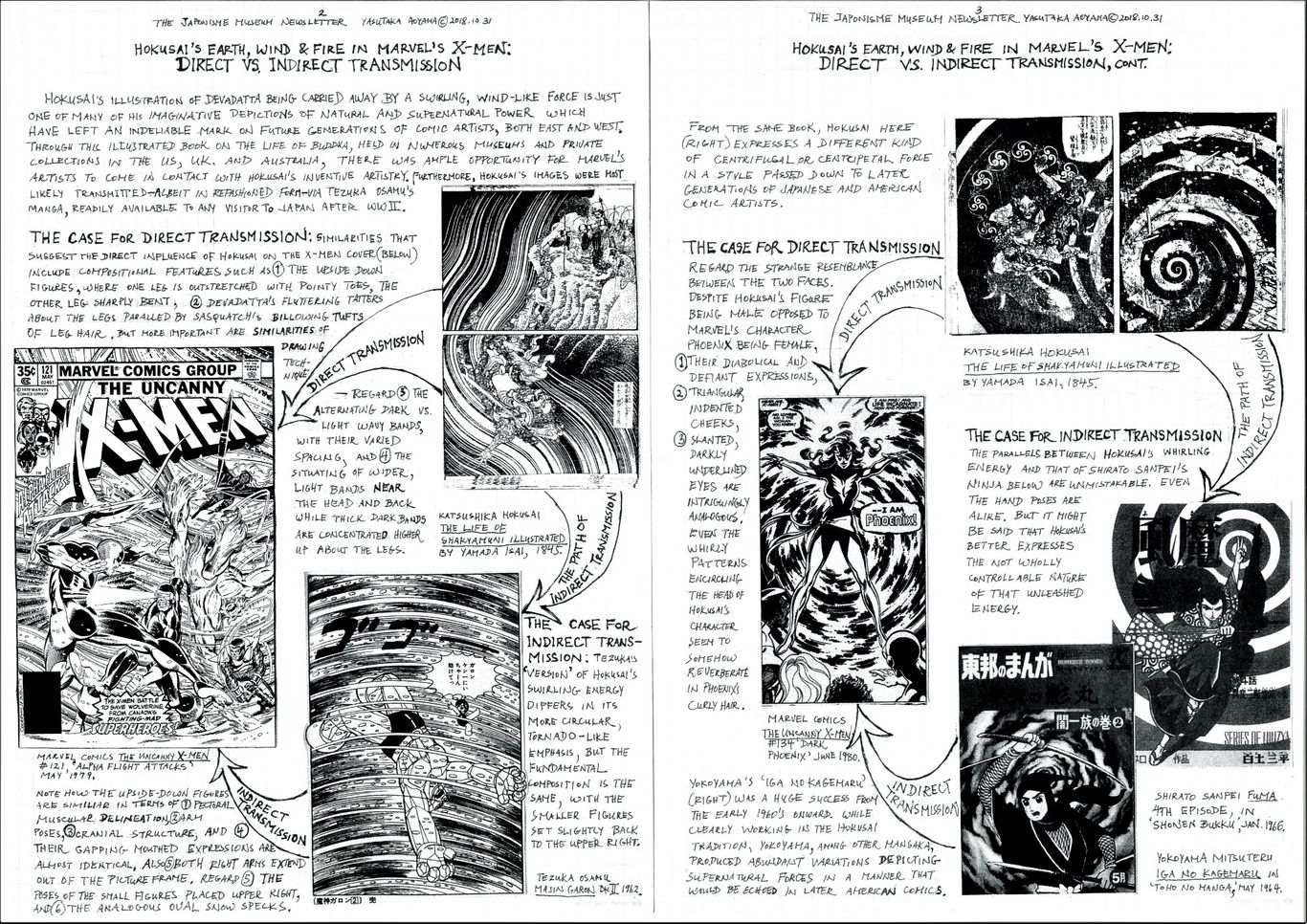
As examples of direct and indirect transmission, images from Marvel Comics’ The Uncanny X-Men #121 May (1979) and #134 June (1980) have been paired with two pictures by Katsushika Hokusai from Yamada Isai’sThe Life of Shakyamuni Illustrated (1845); and as modern Japanese versions of Hokusai influenced manga, examples from Tezuka Osamu’s Majin Garon (1959-1962), Shirato Sanpei’s Fuma (4th episode, Jan. 1966) and Yokoyama Mitsuteru’s Iga no Kagemaru (episode of May 1964) have been provided.
In the previous issue of this newsletter (Aug. 2018) it was proposed that the creators of the refashioned X-Men of the mid-1970’s onward---Chris Claremont and his various collaborating artists---were familiar with the manga of Tezuka Osamu. Manga images were utilized in an eclectic manner towards character development and interactions, along with techniques of drawing and framing scenes. All to say that the ‘new’ in art is not created in a cultural vacuum plucked out of nowhere, simply the result of a flash of genius; but rather, a discernable evolutionary process, almost always with its historical precedents (though they may be from unrecognized sources outside the mainstream artistic tradition), modified and adapted to the needs of the artist and his era.
The question then arises, however, if late 20th century American comics were influenced by mid-20th century Japanese manga, as to what that Japanese manga owes to; and the answer, according to post-WWII mangaka themselves, frequently includes an open admission of the influence of specific American cartoonists. Tezuka, for instance, in his published writings (Tezuka, 1982) dwells fondly upon his exposure to the cartoons of George McManus (1884-1954) and Milt Gross (1895-1953). In any case, in Japan it is an oft repeated mantra that Japanese mangaka learned from Western artists.
However that does nothing to aid us in explaining the new types of superhero images and the manner of depicting their expansive powers and energy emanations as they appear in latter 20th century American comics, of which there are few precedents in the Western artistic tradition, but plenty in ukiyo-e depictions of bodhisattva (Buddhist) and kami (Shinto) deities, and other supernatural beings known as yokai, characteristic of the Japanese artistic tradition.
It should be made clear that Hokusai’s drawings are one example among countless others, simply being the best known and most accessible to the West since the latter 19th century. In America, especially in the late 1950’s, which experienced a resurgence of general interest in Japanese culture from zen meditation to judo self-defense, the popularity of ukiyo-e prints, including those of Hokusai, is testified to by the likes of Frank Lloyd Wright and the best-selling novelist James Michener, who published his own commentaries on Hokusai’s Manga in 1958.
In stark contrast, post-WWII Japanese artists lived in an ideological environment---that of a sorely defeated nation---where the underlying cultural paradigm now equated traditional Japanese culture as feudal and obsolete, and Western culture, especially American culture, as liberating and progressive. Thus, Japanese mangaka were no more forthcoming, if not less so, than their American counterparts in admissions of any influence coming from ‘feudal age’ sources. But in fact there is a clear and continuous link of drawing technique and chromatic sensibility between medieval Kamakura emaki (picture scrolls) and later ukiyo-e prints on to post-WWII artistic creations, where even a perfunctory look reveals undisputable parallels and often direct remakes of historical and religious narratives. Therefore the need for a discussion of direct and indirect transmission of traditional Japanese sources to modern Japanese and American comic imagery, that looks beyond a narrowly defined genre of comic art.
***********
December 2018
Hokusai’s Earth, Wind & Fire in Marvel Comics’ X-Men, Part II
Fiery Apparitions in Looming Fire
or
The Iconography of Combustion
Yasutaka Aoyama
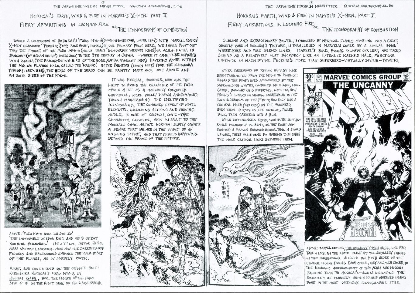
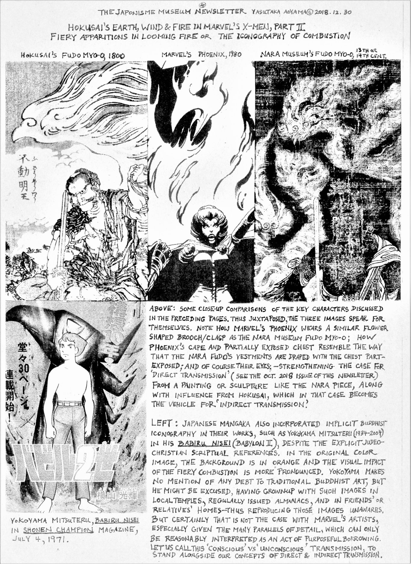
Katsushika Hokusai’s drawing of the Buddhist deity Acala-natha (in Sanskrit) or Fudo Myo-o (in Japanese) meaning ‘Immovable Wisdom King’), in his book of illustrative styles Hokusai Gafu (1800), is a prime example of how his creative interpretations of traditional religious motifs have inspired modern superhero imagery. His Fudo-Myo-o is quite original in conception; at the same time a very clear Esoteric Buddhist (Mikkyo) iconography is maintained, characteristic of sects such as the Tendai, Shingon and Shugendo, in terms of facial features/expressions, body poses, vestments, halo (kohai) and auxiliary figures (attendants known as kenzoku), among other identifying traits. Many of these traits appear to have been transposed onto Marvel’s X-Men character ‘Phoenix’, as depicted on a cover done by John Byrne (penciler) and Terry Austin (inker) for The Uncanny X-Men #134, June 1980.
For added perspective, a much older Fudo Myo-o painting than that of Hokusai’s, dating back to the 13th or early 14th century, at the Nara National Museum, has been included; the reason being that aspects of the X-Men cover indicate a knowledge of religious imagery more strictly traditional than that of Hokusai’s, closer to a symbolism maturing in latter Heian times (11th and 12th centuries). Passed down in painting and statuary, these more orthodox images of the Fudo Myo-o are easily encountered in temples and even altars of private homes across Japan---not to mention books, museums and dealers of oriental antiques in Europe and North America.
Thus, whatever the means by which the Myo-o was observed by comic-book artists, it may very well be that an extremely ancient, esoteric Eastern iconography, extending back a millennium, resurfaces in modern pop media unawares to the young contemporary Western reader/viewer, in what he believes is a product of purely futuristic, ahistorical, comic fantasy.
It is no wonder that Marvel’s artists might have found the Fudo Myo-o inspirational. Even the most faded, worn-out images of the ‘Immovable One’, the ‘Light of Wisdom King’ make a startling impression of the viewer—who may be surprised to know him to be a force for good, not evil. His fearsome expression is often explained as the wrathfulness of a Dharmapala, a vigilant guardian of the teachings; but perhaps better understood as a means to confront and dispel the enemy within ourselves, desires and vices which cause suffering and delusion, leading us astray from Enlightenment. In Japan, his fiery halo, called the ‘kaenko’, came to be depicted in great variety, but usually turbulent and billowing with almost prehistoric ‘Jomon’ élan. Swirling in distinct curls, one or more of those flames above the head of the fierce deity often takes on the shape of a bird (Karula—Garuda of ancient Hindu origin) in outline form, with pronounced upper beak and hollow eyes with coiling lines. The X-Men cover in question repeats many aspects of this iconography.
We should add that although Acala does exist in Chinese Zhenyan (Tangmi) and Tibetan Buddhist painting, it is certainly rarer and markedly different in style than the Japanese works under consideration here. The halo, for instance, is usually more decorative and symmetrical without the Karula-in-flames; and auxiliary figures, if included, are placed in a more rigidly schematized, mandala-type array.
These distinctions are important to grasp, for all too often, blanket claims of the continental origins of Japanese art impede our appreciation of the specific imagery involved, obscuring our understanding of the substantive process of artistic influence in this day and age. Or to borrow terms from logic, while Indian and Chinese art was necessary for the development of Japanese religious art at the time, it is A) ancient works of art from continental Asia extant only in Japan, and more importantly, B) works indigenous to Japan and divergent in style from the continent, which are the necessary and sufficient causes for explaining the appearance of esoteric Buddhist iconography in 20th century Japanese and American comic imagery.
Bibliography
Claremont, Chris; Byrne, John; et. al., Essential X-Men Vol 2. Compilation of issues 120-144, April 1979 -April 1981. New York: Marvel Publishing, 2005.
Katsushika Hokusai, Hokusai Gafu. Bishu Nagoya: Publisher Eiraku Toshiro, 1800.
The Official Site for Marvel, fact file on The Uncanny X-Men, #134. Online at www.marvel.com.
Nara National Museum, Fudo Myo-o Hachi Dai Doji Zo. Online at www.narahaku.go.jp.
Orzech, Charles, ed. (2011) Esoteric Buddhism and the Tantras in East Asia. Leiden: Brill.
Yonezawa Yoshihiro, series ed. (1998) Yokoyama Mitsuteru Manga. Kodomo no Showa-shi series, Bessatsu Taiyo magazine. Tokyo: Heibonsha.
***********
February 2019
Hokusai’s Earth, Wind & Fire in Marvel Comics’ X-Men, Part III
Blasting Earth and Blinding Light;
Japonisme as Big Bang Theory of Comic Art
Yasutaka Aoyama
Katsushika Hokusai (1760-1849) was a true innovator in depicting all kinds of natural and supernatural forces, and his graphic techniques had a marked effect upon later generations of Japanese and American comic artists. In previous issues of this newsletter, we examined wind/wave-like forces in whirling and undulating form (2018/10/31), and then combustible/heat-emitting energy in forms flaming and glowing (2018/12/31).
Here we take a look at Hokusai’s vivid portrayal of explosive/radiating energy in particulate and light-beam form. We find a distinct compositional structure to the act of depicting explosions by Hokusai, one that resurfaces in American superhero/action comics more than a century later. That includes 1) his method of clearly delineated and contrasting lines emanating from the central character, 2) poses of figures exposed to the blast, and 3) the manner of ‘sandwiching’ figures with the particulate and beam-like representations. This Hokusai-style manner of depicting an explosive blast of energy emanating from a super-hero/villain has now become a standard part of the comic book repertoire, but his drawings still have the power to astonish us---as they must have comic artists in the latter 20th century.
Our example, a picture from the Hokusai illustrated book by Kyokutei Bakin(1767-1848) Chinsetsu Yumiharizuki (1807-1811), which literally translated would be ‘Strange Tales of the Bow-Strung (i.e. crescent shaped) Moon’, recounts the superhero-like feats of the samurai warrior Minamoto no Tametomo(1139–1170). This has been juxtaposed with an X-Factor (spinoff series from X-Men) cover for Annual 8 (1993), designed by Aldrin Aw (‘Buzz’) and Chris Ivy. When the Hokusai and Marvel images are placed side by side, the similarities of the kind mentioned above become readily apparent.
The X-Factor cover also indicates that the artistic influence of Japan was not an isolated phenomenon shared only by those who worked directly with Chris Claremont from the mid 1970’s to the early 1980’s, but something of a tradition, passed down within Marvel Comics to a generation younger than those who had been working on X-Men in the preceding decades. Indeed, familiarity with the full spectrum of superhero-type comic imagery makes it clear that Japonisme was a broad trend in American comic art at the time. It was not simply an idiosyncrasy of a few 20th century cartoonists—no more than it was among impressionist painters of 19th century Europe. And while that influence upon the designers of the X-Factor cover is not evident at first glance, elsewhere in their other works it is quite explicit, such as in Aldrin Aw’s illustrations for the Caliber Comics series Kabuki: Masks of the Noh (1996)where red suns or the kanji characters ‘歌舞伎’ are part of every cover.
Moreover, multiple Japanese artistic strains can typically be found in a single modern comic image. In the X-Factor example presented here, it is likely that Hokusai was not the only Edo or Meiji period artist whose works were sampled by Marvel’s art team. For instance, Kawanabe Kyosai (1831-1889)’s technique of drawing beams of light lined with flames, as seen in his print Nanba Senki no Uchi (‘From the Records of the Namba Battles’), may have been adapted for the X-Factor cover. And we might also add that the X-Factor cover’s color scheme reminds us of Kyosai’s flamboyant chromatic sensibilities, though not discernable in the following monochrome pages.
The point being, as seen in all previous issues of this newsletter, and as we will be seeing in future issues, that the end product of superhero-type comic art appears to be the result of borrowing from diverse Japanese precedents. So many of the motifs of modern comic imagery can be said to reproduce Edo period or even earlier Japanese artistic prototypes, as well as much that comes henceforth from Japan, that one feels compelled to propose the following thesis:
The impact of Japanese artistic models, that is to say the interest in Japanese art that fully blossomed in 20th century America after Europe, was the metaphorical ‘Big Bang’—the originating force that brought the superhero comic universe into existence—and then provided the needed energy for it to continue to expand.
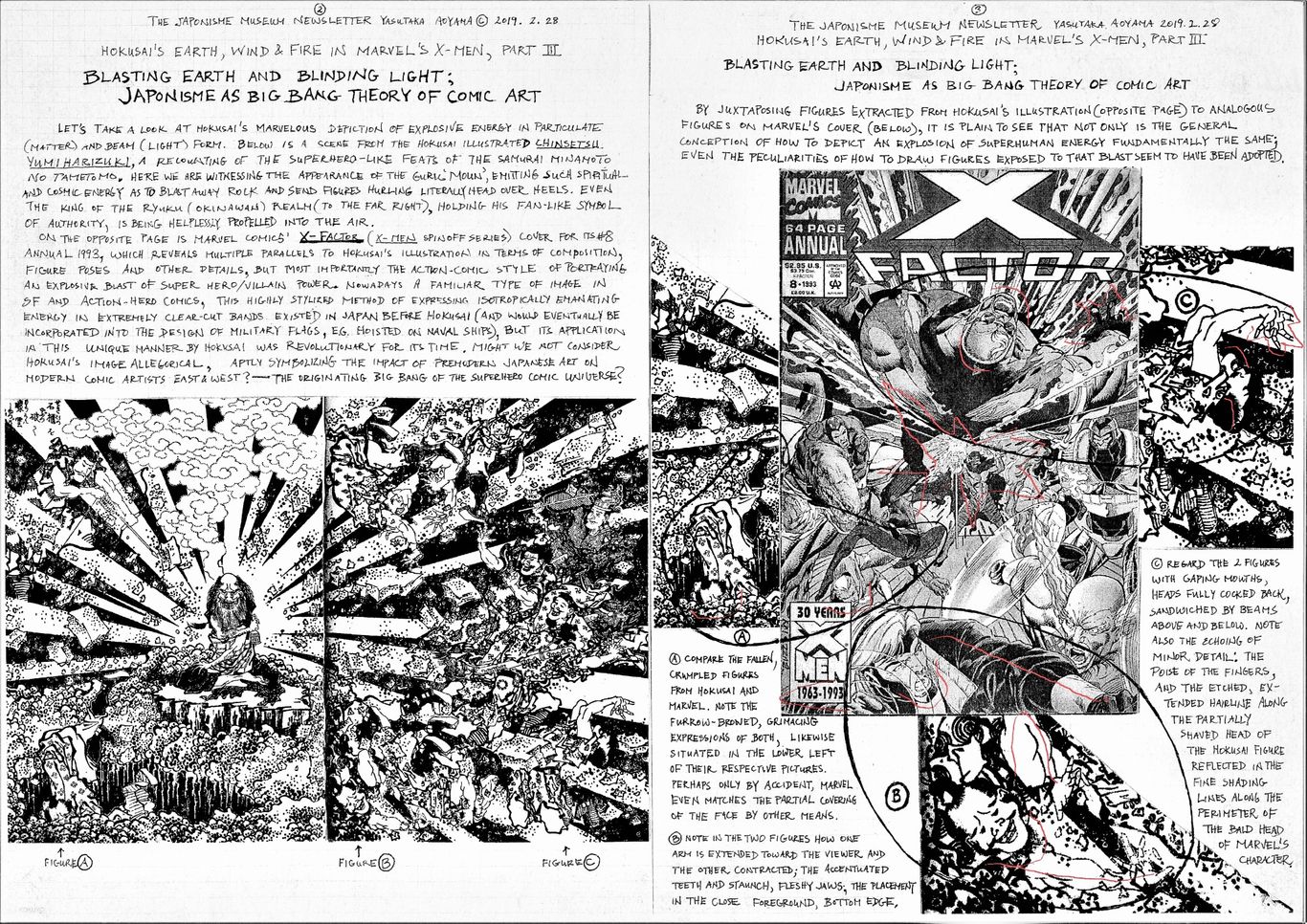
***********
August 2018
Japonisme in American Comics
Tezuka Osamu's 'GARON' vs. Marvel Comics' 'GAROKK'
Yasutaka Aoyama
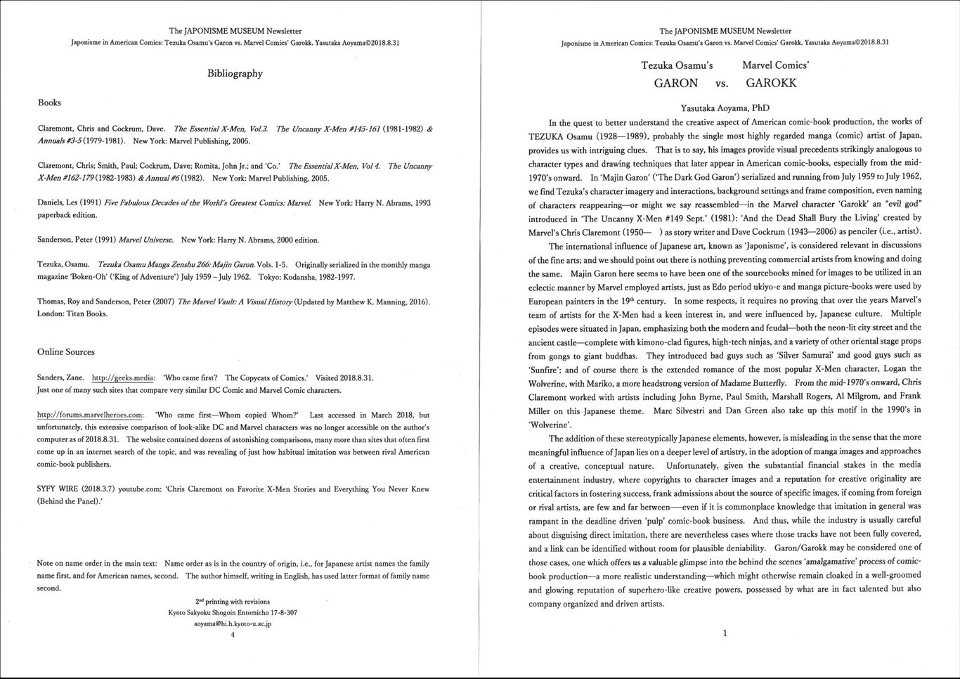
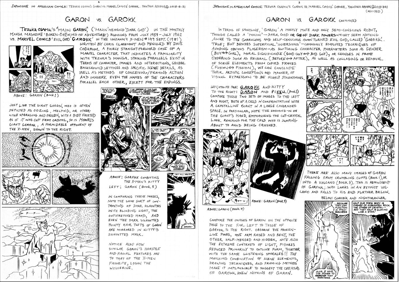
***********